Data visualization can be defined as the process involved in creating a graphical representation of data. The process is designed to assist the presenter in communicating data so that the viewers can draw conclusions and interpret the data with ease. Data can be interactive or static, depending on specific requirements. Data visualization techniques can also help create data in various forms, including infographics, maps, graphs, and even PDF charts. The purpose of data visualization is to simplify the process of identifying patterns, outliners, and trends in data. Data visualization is being used regularly by data professionals to summarize important insights in data and also relay the information obtained back to the appropriate stakeholders.
Management personnel can use data visualization created by data professionals to project an organization’s structure. Data visualization can be used to uncover the underlying structure of data so that data scientists can have a better understanding.
Importance of data visualization techniques
- Visuals enable readers to extract incomprehensible, complex data into an understandable form. It, therefore, enhances the audience's capability to capture crucial insight.
- Graphs and PDF charts can be used to uncover the patterns, trends, and outliers that might not be obvious to casual observation of raw data.
- Visualization may serve to communicate findings more effectively, as might be the case in comparison with text only. The communication of insights also becomes much easier for stakeholders.
- Through data visualization, an organization would be in a better position to make decisions on time, as the visualizations may point to important data that is normally at first sight.
- Well-designed visualizations have the capability to keep their audience and retain their attention more than reports could ever do, hence stimulating discussions and deeper explorations of the data.
- The representation of data in a visual manner will make it more accessible to non-technical backgrounds and expand the circles that can interpret information.
14 Amazing Data Visualization Techniques
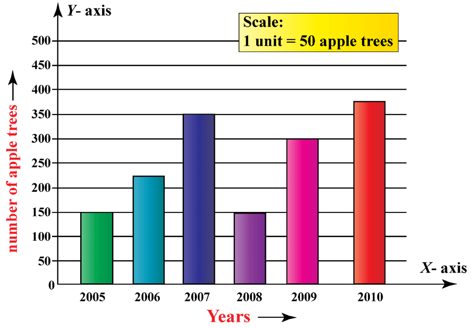
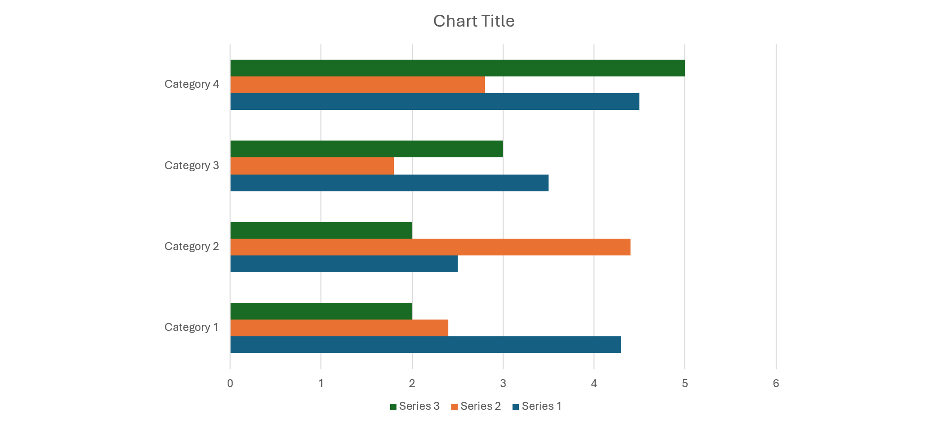
1. Bar Charts
Bar charts are good for comparing categorical data. They show values as rectangular bars. In design, they are simple; thus, allowing the reader to understand immediately the differences between the different categories. These are good for showing discrete values. They can be plotted vertically or horizontally. The disadvantage is that they also can be cluttered if many categories or narrow values are used.
Key Features:
- Easy to make
- Good for comparisons
- Multiple series can be shown.
Benefits:
- Easy to read
- Good for categorical data
- Visually straightforward.
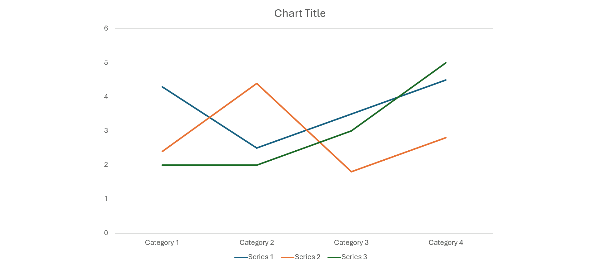
2. Line Charts
Line charts are efficient in showing a trend over time, where lines connect the data points. They provide quite a clear insight into how things go up and down while showing patterns. They are, therefore, more suitable for time-series analysis. However, when there are many lines or too many data points, it becomes cumbersome, this blocks insight into the information.
Key Features:
- Displaying of trends across time
- Data points are connected using lines
- Can display multiple series.
Benefits:
- Very good for data across periods
- As trend spotting is quite intuitive
- It is easy to read.
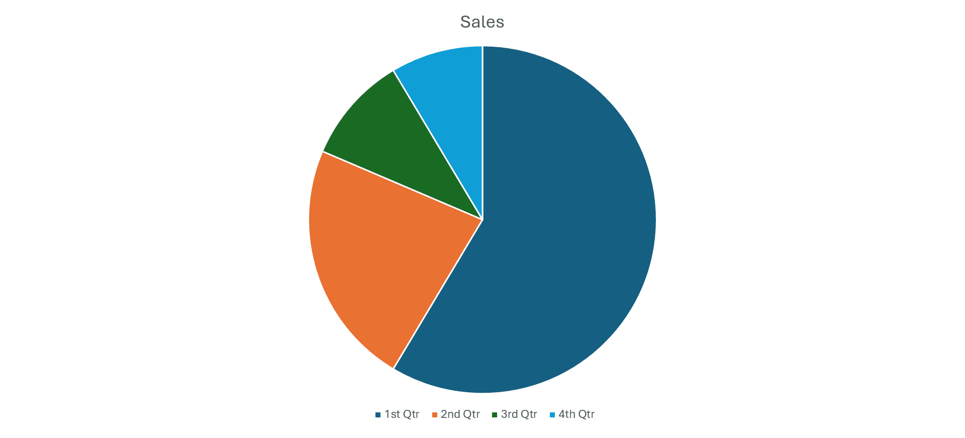
3. Pie Charts
Pie charts show the proportion of a whole through slices, which in turn depict percentage shares. They provide a graphical representation of simple data in some sort of appealing way. At the same time, they might be misleading if too many categories are involved, or when the size difference is so fine that one could hardly make a comparison.
Key Features:
- Circular graph
- Depicts proportions of a whole
- Ideal for fewer categories.
Benefits:
- Aesthetically pleasing
- Intuitive sense of the whole
- Easily comprehensible.
4. Heatmaps
Heatmaps are data intensities represented in two dimensions using color gradients. Heatmaps draw patterns and their correlations very well through color gradients. They are convenient when one deals with large volumes of data because, through them, trends can easily be spotted. However, this could be a challenge to interpret heatmap visualizations if the color choices are bad or the data itself does not have good context.
Key Features:
- Color encodes data values
- Useful to show a correlation
- Can display density.
Benefits:
- Patterns pop
- Visually striking
- Useful for big data.
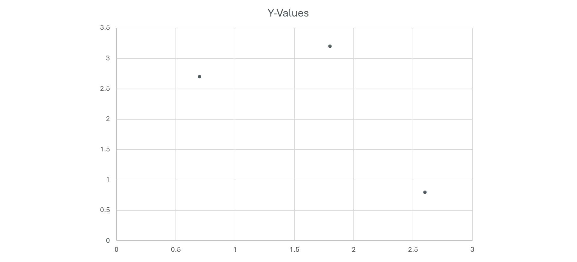
5. Scatter Plots
Scatterplots are graphical representations that visualize the relationship between two continuous variables. They represent data observation using points. For showing correlations, clusters, and outliers, scatter plots are great. However, for such plots, interpretation may be tough when the data points are too dense, and sometimes additional context such as trend lines may be required in order to make such a chart make sense.
Key Features:
- Plot values of two variables useful to display correlation
- Points can represent additional dimensions.
Benefits:
- Excellent for discerning correlations
- Can show clumping
- Works with a large amount of data.
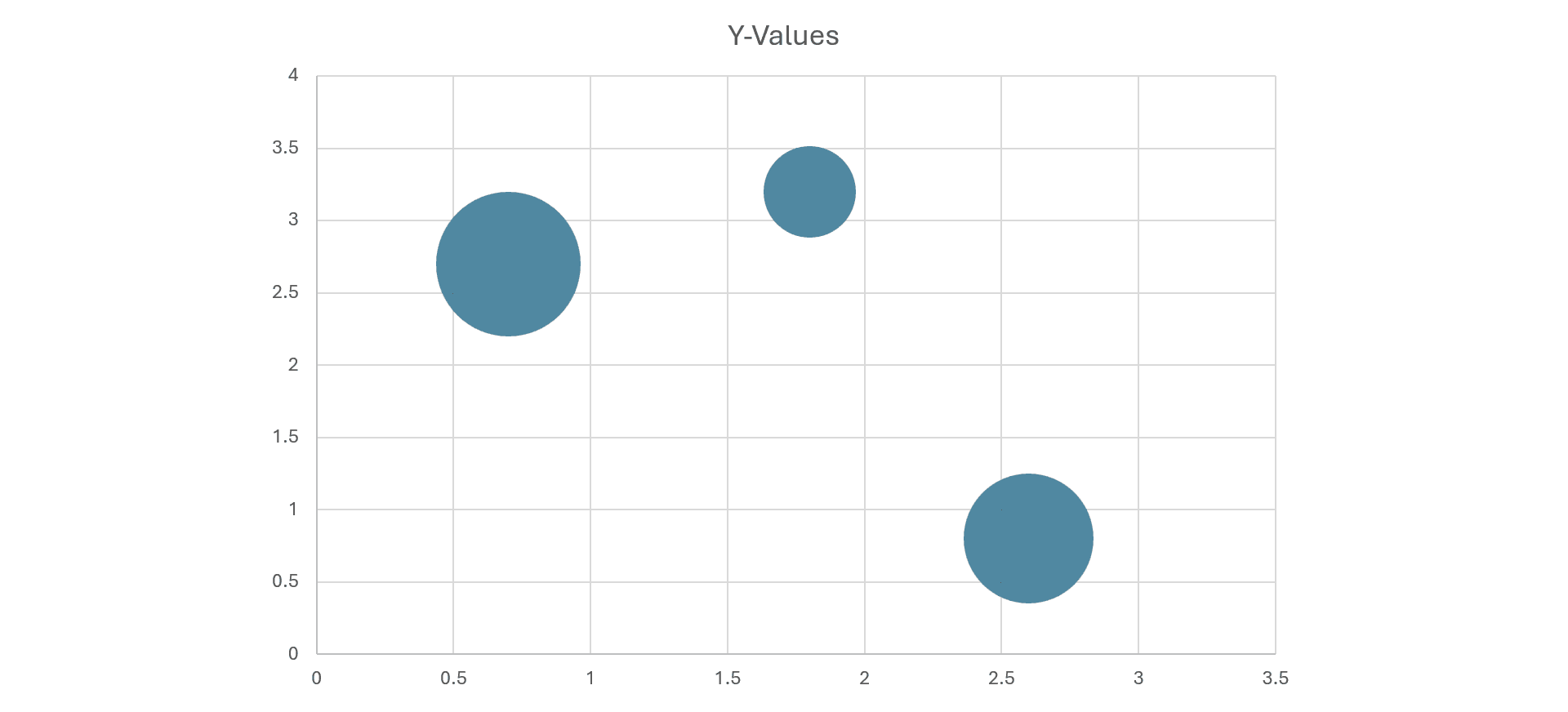
6. Bubble Charts
Bubble charts expand the capabilities of scatter plots by including a third dimension—size—that displays added data variables. They are very clear and show relationships with clarity while simultaneously giving a comparative overview over many sets. In contrast, they get cluttered and hard to read if too many bubbles are shown, or if sizes are not intuitive.
Key Features:
- Similar to Scatter plots
- Points replaced by bubbles
- Third variable added via size
Benefits:
- Shows three dimensions
- Good for showing distributions
- Format is more engaging
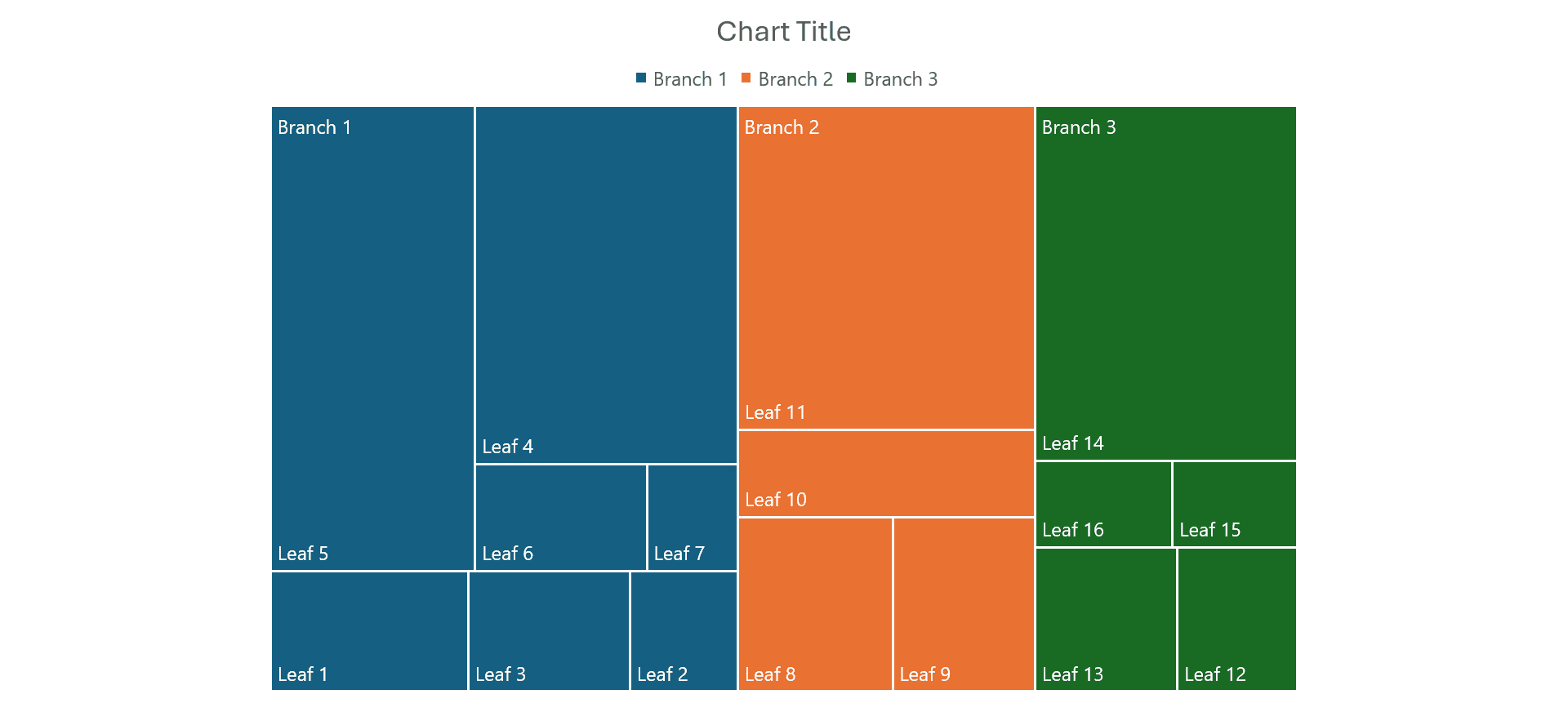
7. Treemaps
Treemaps show this hierarchy as nested rectangles, where the area represents magnitude. They effectively communicate complex relationships within data and the proportions of different categories within a constrained space. However, they can be difficult to read when the number of categories is high or when the colors do not adequately differentiate the segments.
Key Features:
- Treemaps visualize data by using nested rectangles to show tree-like structures displaying hierarchy and proportions.
Benefits:
- Very space-efficient
- Clear hierarchy
- Has the ability to handle very large datasets.
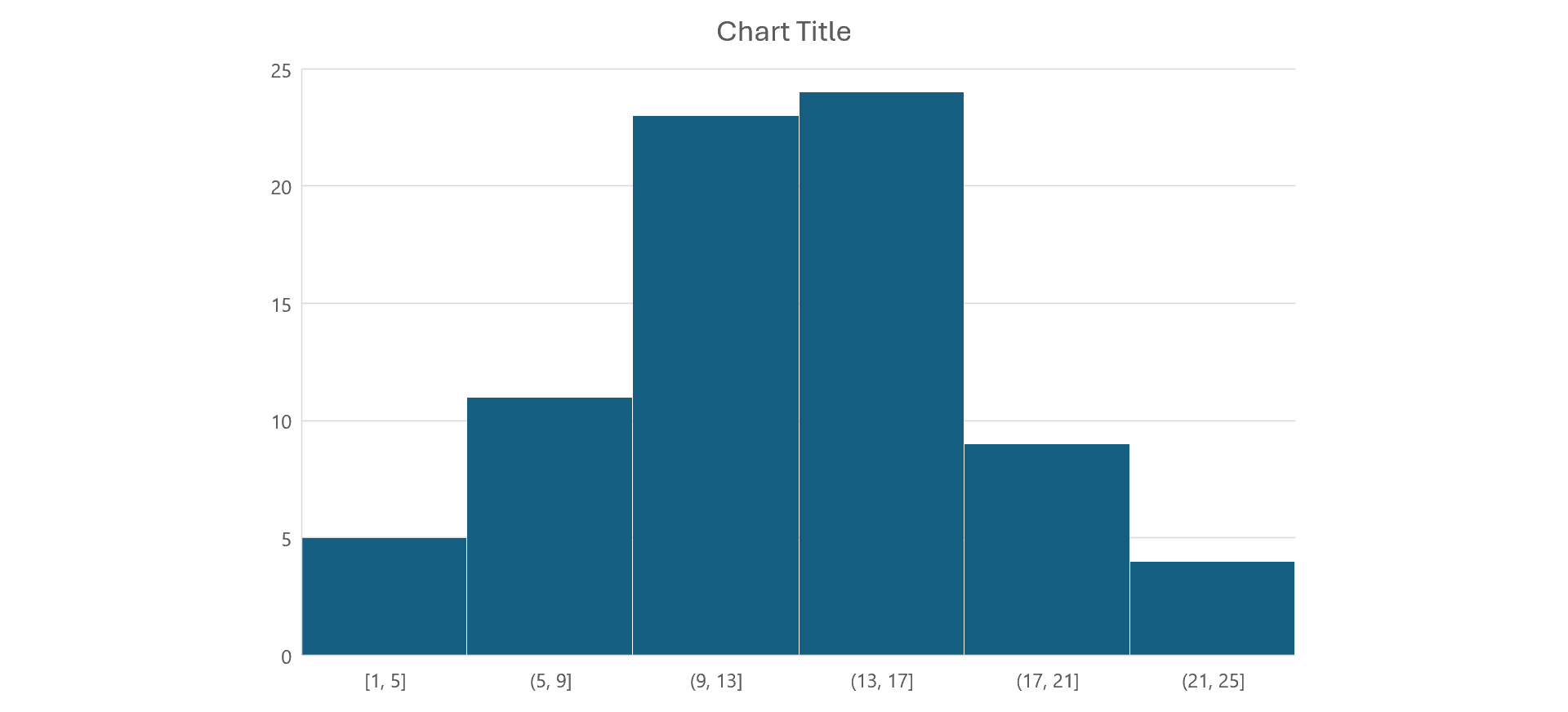
8. Histograms
Histograms are graphical representations that show numerical data distribution by forming bins of values with frequencies. Boxplots are particularly good at showing the shape and variability in a distribution such as normality or skew. Poor choices of bin size can shift the underlying distribution and make interpretations based on false information.
Key Features:
- Show frequency distributions
- Data is divided into bins
- Outline the shape of the distribution of the data.
Benefits:
- Handy for studying the distribution
- Clearly shows frequency
- Useful when dealing with continuous data.
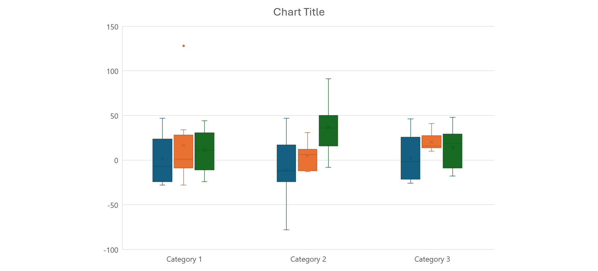
9. Box Plots
Box plots summarize data distribution through quartiles by showing median, range, and potential outliers. They are effective for comparing multiple groups. In their compact design, they are good for quick insights; however, they can obscure detailed distribution characteristics that can be obtained only with further analysis.
Key Features:
- Summary statistics displayed
- Median and quartiles visual
- Outliers in prominence
Benefits:
- Excellent for the comparison of distributions
- Visually compact
- Outliers are well flagged
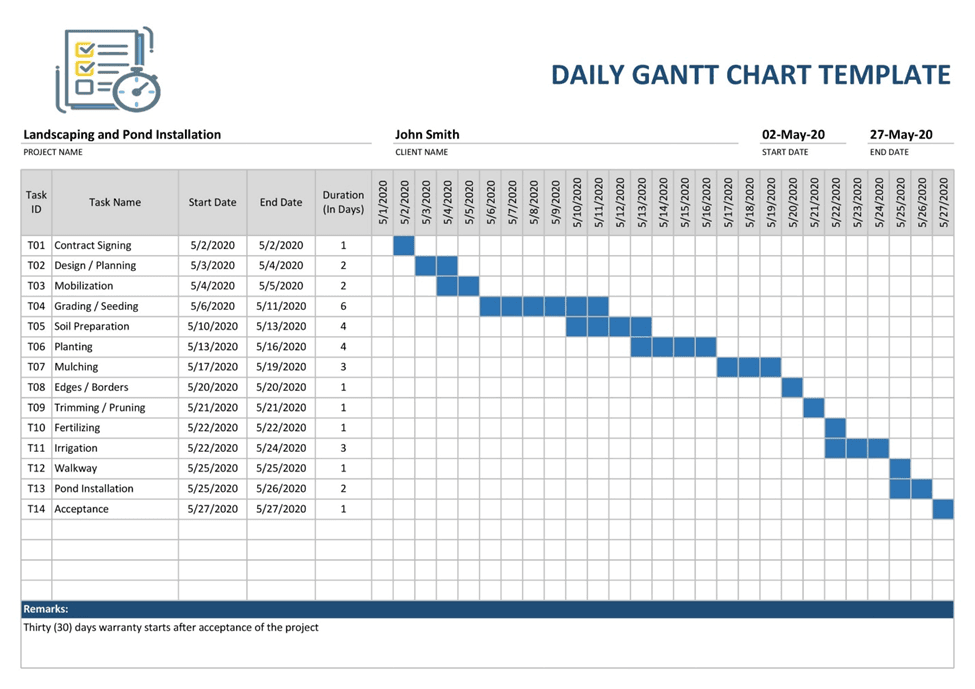
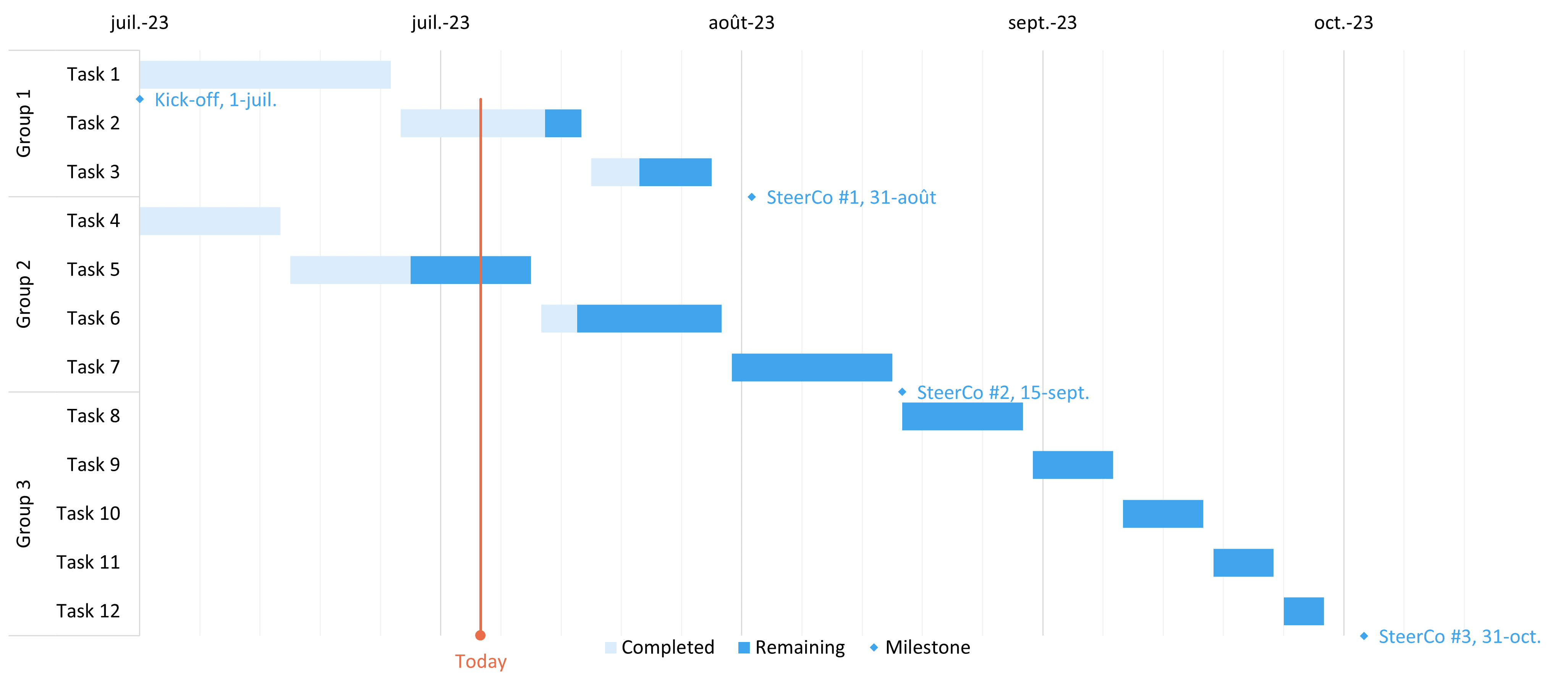
10. Gantt Charts
Gantt charts show the schedule of a project by highlighting activities over time. Gantt charts are good at showing the length of activities, when activities clash, and in what order they come. This is pretty useful for project management. However, for a large number of activities, they get very complicated, and their readability might be an issue for a big project with a detailed timeline.
Key Features:
- Project Scheduling
- Visualizes tasks along timelines
- Can show dependence
Benefits:
- Good for project management
- Displays timeline of events
- Progress is easy to follow.
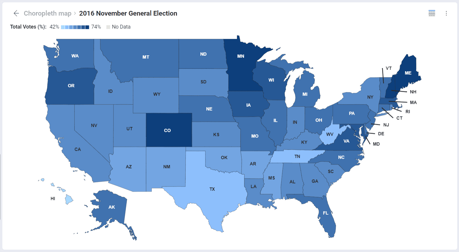
11. Choropleth Maps
Choropleth maps represent data about geographical regions by color-coding. Demographic, economic, and social data representations would be effective in this way. They intuitively create an insight into regional differences. However, they mislead when the boundaries are not clear or data is not normalized.
Key Features:
- Colored maps depict data values for regions; useful for geographic data
Benefits:
- Good method to show spatial data
- It is catchy
- It presents the differences between different regions.
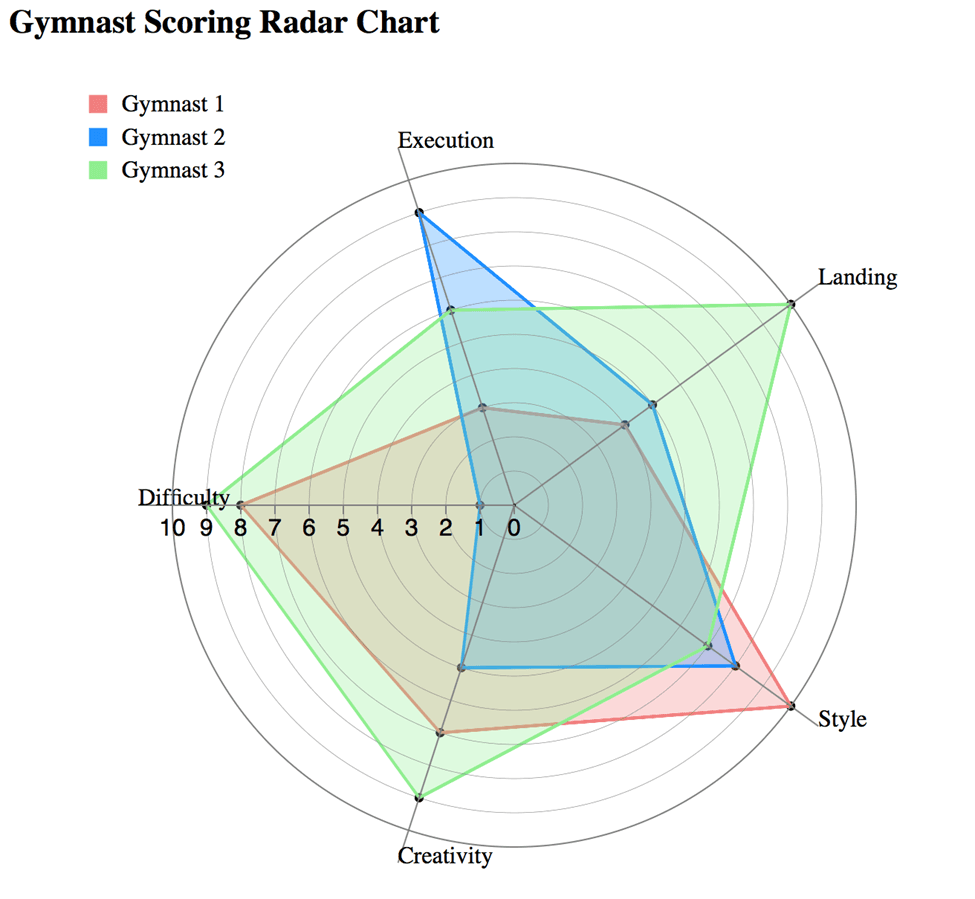
12. Radar Chart
Radar charts visualize multivariate data on axes originating from a central point, making it easier to compare over multiple dimensions. It is useful to show the strengths and weaknesses of, for instance, specific groups in one view. They are not easy to read when there are too many variables or when several data lines overlap, which may mask valuable information.
Key Features:
- Plots multivariate data into a circular format
- Depictions of strong and weak points.
Benefits:
- Good to compare, visually interesting
- Shows multidimensional relationships
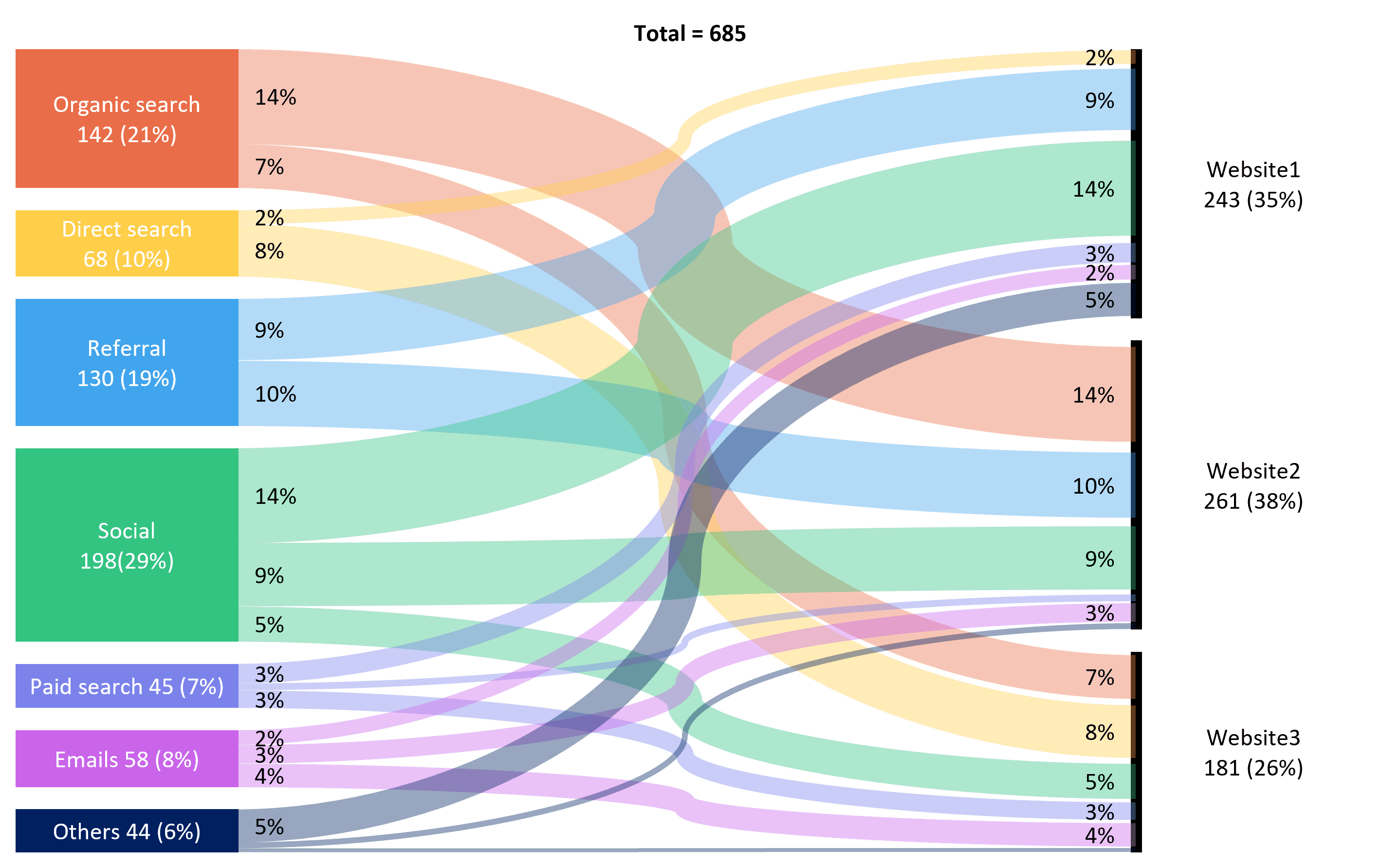
13. Sankey Diagrams
Sankey diagrams are flow and relationship diagrams, where the quantity is depicted by arrows. They are very effective in showing interaction between complex data: energy flow, financial flow, or any other kind of flow. The major disadvantage of a Sankey diagram is that if too many flows exist, it will get cluttered and interpretation might be difficult. They need careful design to keep the diagram clear.
Key Features:
- Flow diagram of relationships
- visualize flow between nodes.
- Good to display changes.
Benefits:
- Communicates complex relationships effectively
- Interesting to view
- Proportional flows noted.
14. Network Diagrams
Network diagrams are the visualization of relationships of entities through nodes and lines between the nodes. It is particularly good for showing hard-to-figure-out interdependencies, like social networks or systems of data. If the connection is too dense, however, it can be impossible to discern insightful information without careful focus.
Key Features:
- The ability to visualize the connection
- It has nodes, and edges that help in depicting the relationships between various entities.
Benefits:
- Greatly informative in comprehending complex systems
- Ingenious, brings out the interactions quite well.
FAQs
Q: Why is data visualization important?
A: Data visualization helps the audience make sense of huge sets of information, instantaneous detection of trends and patterns, and assists in decision-making. It allows stakeholders to catch insights quickly that would be difficult to realize through raw data formats.
Q: What are common techniques for visualizing data?
A: Common techniques include:
- Bar Charts
- Line Charts
- Pie Charts
- Heatmaps
- Scatter Plots
- Bubble Charts
- Treemaps
- Histograms
- Box Plots
- Gantt Charts
- Choropleth Maps
- Radar Charts
- Sankey Diagrams
- Network Diagrams
Q: When can I use a bar chart?
A: Use bar charts when you want to compare quantities across different categories. In general, they are good for showing discrete data and are relatively easy to interpret at a glance.
Q: What are the advantages of line charts?
A: Line graphs are effective at showing up-and-down trends over time. They clearly reveal fluctuations in data and, for this reason, are well-suited for time series analysis.