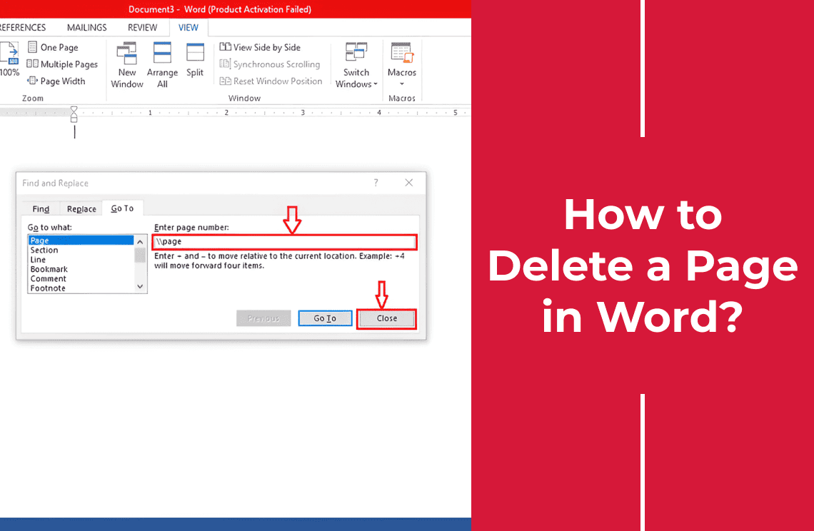
Google Docs is used by millions of people worldwide because it is a useful online tool for creating shareable documents. Furthermore, these documents can be updated at any time and others who have received the document will have their copies to reflect the real time changes. It is one thing to know about Google Docs tables but it is another to understand how to create tables in Google Docs.
If you want to achieve your goals such as computing data, storing information or sharing spreadsheets, and making presentations you must master the tools.
In this article, we are going to reveal all there is to know about Google tables, charts and graphs and how to make use of them. At the end of the article, your understanding of the application will improve maximally and you'll have no qualms about using other solutions.
Why Use Google Docs Solutions?
Google Docs have graphs, charts and tables and they are designed to serve the same purpose of information computation and dissemination. With a Google graph, for instance, you can create data models or visualizations to enhance your resume, reports, or any presentation. This will help you and others interpret the data sets by showing their differences in relatable form.
When creating reports and slides, using graphs can help you summarize or modify your information in numbers rather than in writing. The same is the case for tables that allow you to table information clearly and concisely. Charts allow you to show the degree of relationship between different data sets for easy understanding.
How To Construct A Graph With Google Docs?
Before we show you how to make a graph it is important to know the different types.
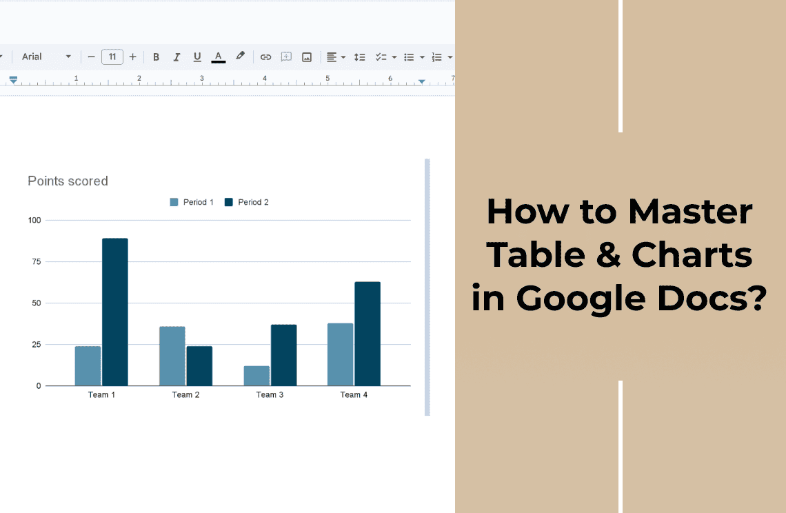
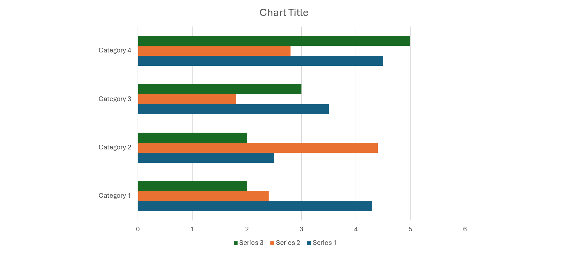
Bar: A Bar graph contains metrics sitting side by side so the user can compare them. These metrics are measurements spanning specific durations or tracking changes over some time.
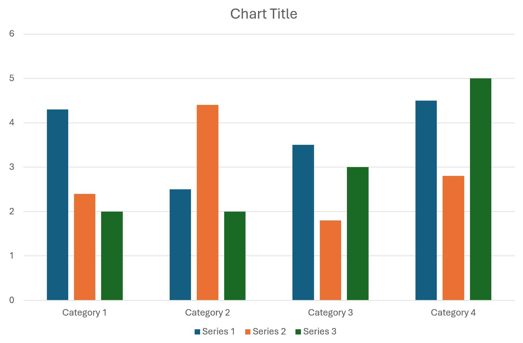
Column: This is a type of graph that’s not so different from a bar graph. The only difference is that it shows data in clusters so users can compare them within their clusters or externally.
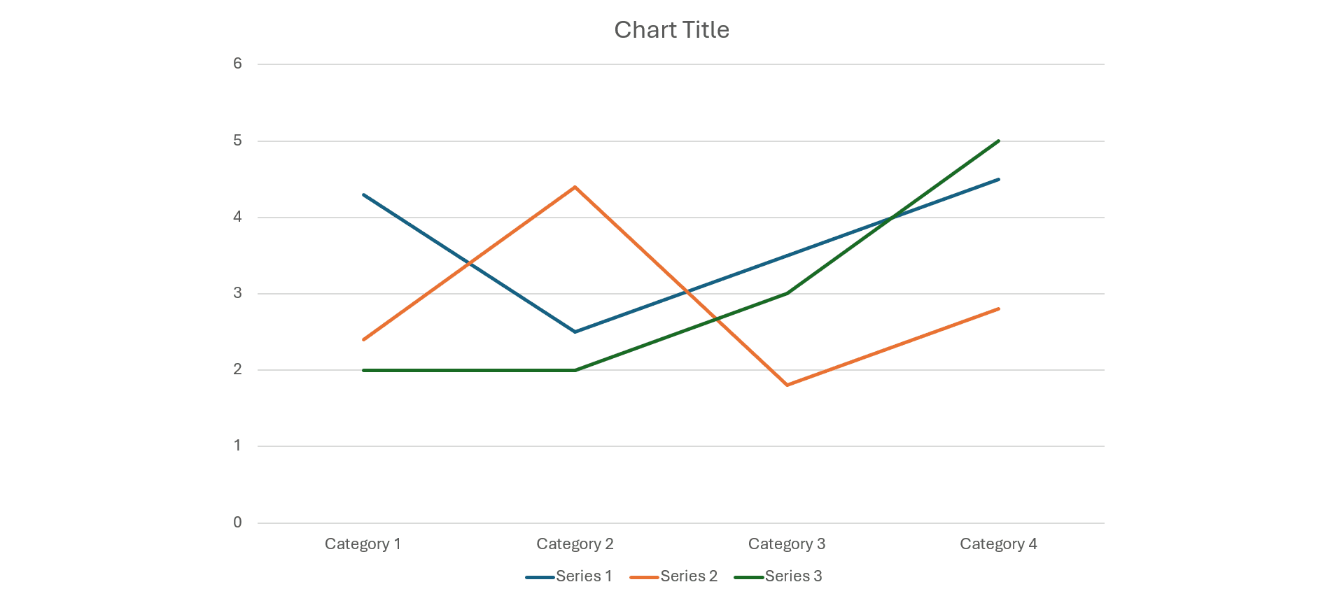
Line: Line graphs have data points showing similar data set differences with lines that overlap. Using the line graph, you can track changes over some time.
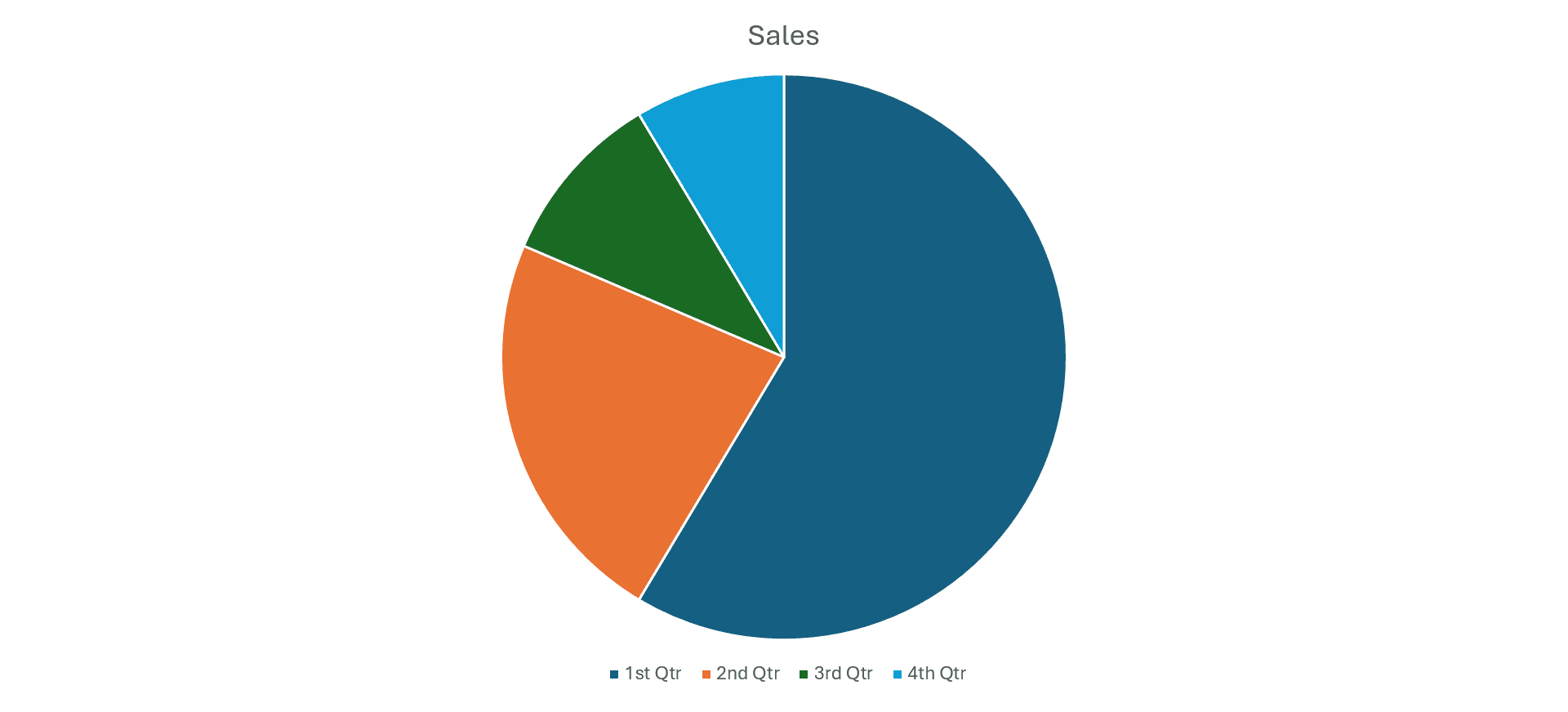
Pie: Pies show the value of items and now they make up a whole. They may not track changes over a timeframe but they show the degree of contribution each individual set has to the whole.
How To Make A Graph?
To make a graph in Google Docs, follow these proven steps.
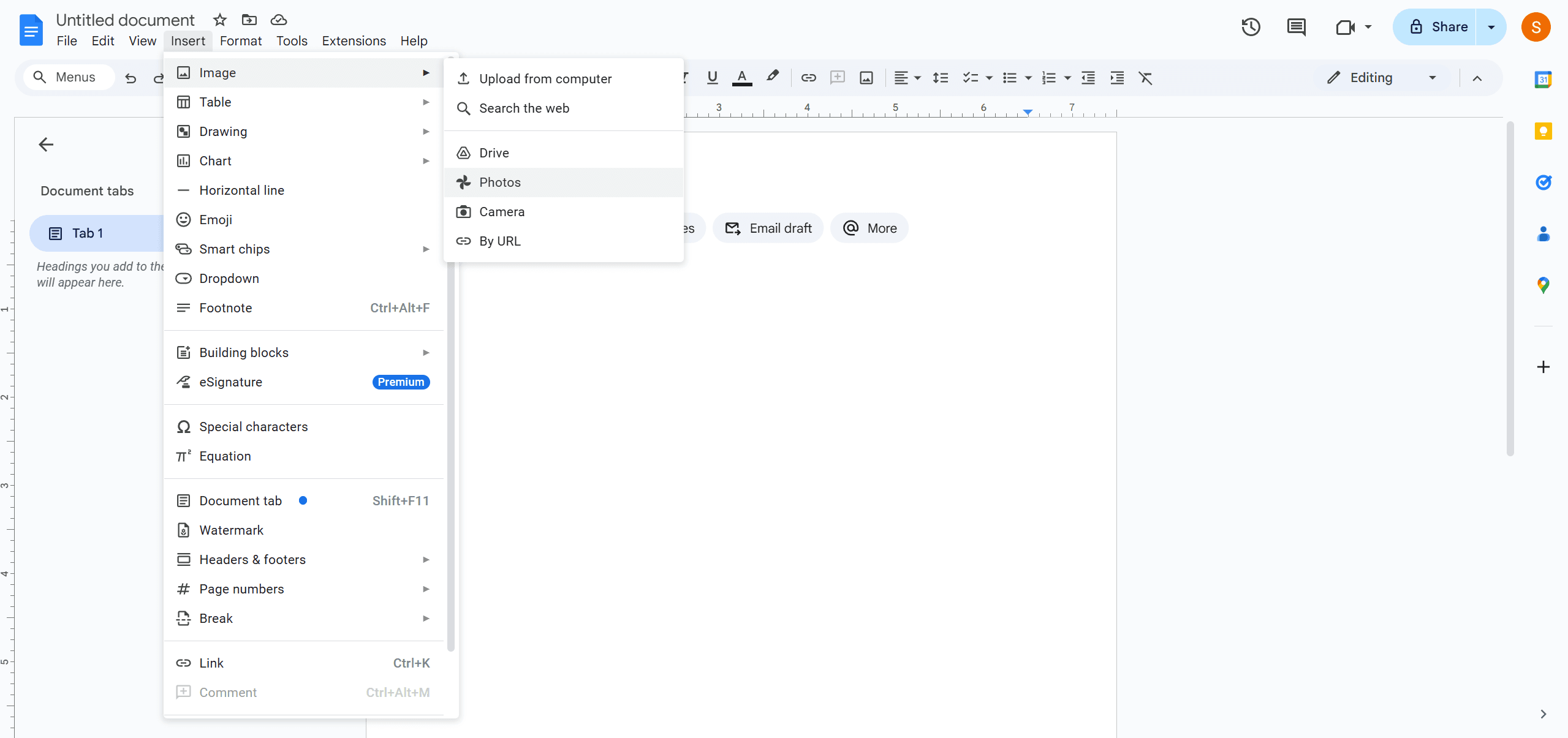
1. Open The Application: The first step is to open the application and then select the document you wish to work on. You have the option of selecting an existing document or a new one by clicking the + sign. The next step is to click the Insert key to reveal the drop down menu. Locate the chart to open the menu sidebar. You will find the graph options.
2. Pick Your Graph: At this point, you must choose the particular graph you want to create. Select your preferred option to create a generic option that you can edit. Note that your changes will automatically be saved to your sheets so you can speed up your work. Once you have created your graph, take the time to adjust the colors and labels to make it more visually appealing. This will enhance readability and ensure that your audience can easily interpret the data.
3. Edit: Edit your graph by going to the pop up menu at the left bottom of your screen to clock" Edit in Sheets". You will find a chain link that you must click to unlink graph docs from Open Source. To start editing, select Open Source and start creating as many graphs as you want.
- Customize: You can customize the designs by changing the color, fonts, background, lines, and even the shapes. Do this by right-clicking the special "Customize" option. You can also add Grid lines as many as you want.
- Format: To create changes you can click the graph to reveal the menu for different placements. This will make the graph insert any text you inputted before insertion. You also have the option to pick your preferred lines with wrap or break texts.
- Insert in Sheets: After inputting your data sets you should make sure you can use the graph in documents. Tondo so, go to the "Insert" option in the menu bar then click on Chart to see the options. Click "From Sheets " to open the available spreadsheet. Google Docs will automatically locate your charts in the spreadsheet and link the same to your documents.
How To Make Charts With Google Docs?
Now let's see the different types of Charts in Google Docs and how to make them. Note that Google offers different chart options that improve visualizations. We will show you the differences and how to make them. To create a chart in Google Docs here are the simple steps to take. Note that these steps work for any type of chart you wish to create.
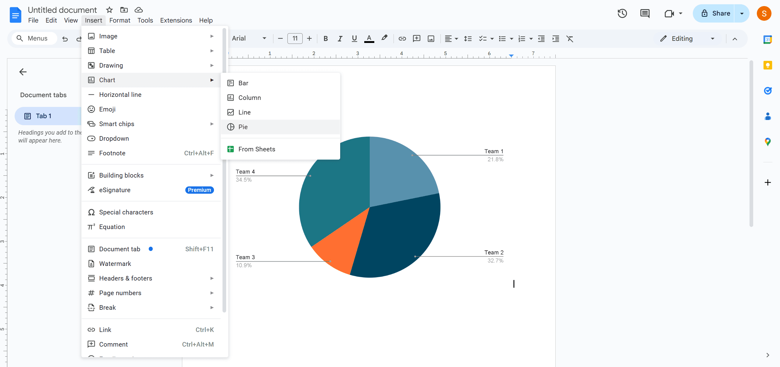
1. Insert Tab & Select: Start by opening an existing or new document on Google Docs then navigate to the Insert Tab. Go to the drop down menu and select charts to see the different options. Click on your desired options from among the ones displayed.
2. Preview: Once you select your desired option it will appear in your document so you can preview it. The next action will be the edition proper.
3. Edit: Select the chart and click the link option. Google will open it in the Spreadsheet application.
4. Update: Update the chart in your document by clicking the “Update” button located at the right hand corner of the page after you are through with your edits.
5. Preview: You will have to preview the updated chart again to be sure that your edits are in order in your document.
How To Create Tables In Google Docs?
Last but not least are Google Docs tables. Tables are widely used by people in different professions because they are easier to create and viewers can easily interpret the information they contain since data are set in an orderly fashion. To create tables in Google Docs, kindly follow these steps.
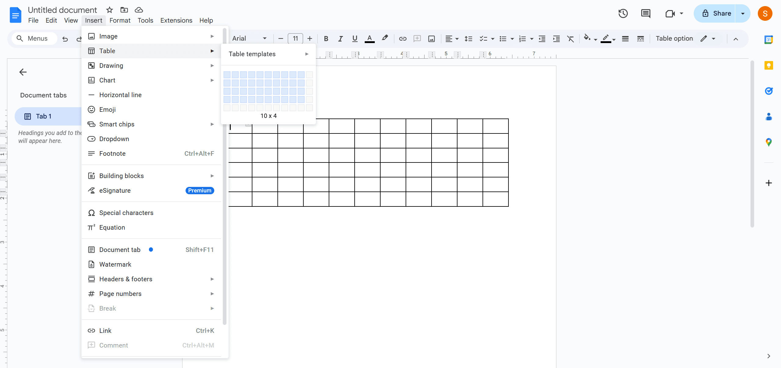
1. Open Documents: Start by opening your documents. Like always, you may open an existing document or work on a new one. Go to the menu at the top left to select your preferred table. Your selection will insert the table on the page. From here on, you can add columns or rows as many as you want.
2. Insert: You can insert rows below or above selected rows or to the right or left of a column.
3. Delete: You can also delete unwanted rows and columns in case you have excess of them. Simply click on the one you want to remove then click the Format option on your menu bar. Choose the table and then select the option to delete the column or row in particular.
FAQs
Q: How do I create a table in Google Docs?
A: Creating a table is very easy in just a few, easy steps. Simply open your documents and press the “insert” button in the menu bar. Select the table and one will appear with a few rows and columns. You can add or remove as many rows and columns as you wish. You can also input your data accordingly.
Q: Is there a particular chart template on Google Docs?
A: By exporting the chart back to Google Docs, you can ensure your data is well-presented. This allows for effective communication of insights and findings within your documents. By exporting the chart back to Google Docs, you can ensure your data is well-presented. This allows for effective communication of insights and findings within your documents.
Q: Does Google Docs have a Chart Maker?
A: Google Docs has a chart maker that allows you to create different forms of charts such as a pie, bar, line, column, or even a scattered chart. The chart maker is very easy to use and is available not only on Google Docs but also on spreadsheets.
Q: How much does it cost to use Google Docs?
A: It is free and you can use it for as long as you wish. Google Docs is an open-source application for users worldwide. With its accessibility across devices, you can collaborate seamlessly with others in real time. This makes it an ideal tool for both personal and professional use.
Conclusion
Google Docs is relatively easy to master if you take your time to master the tips and tricks. It allows users to build, compare and share information to multiple third parties and effect changes on a greater scale. We believe that this article has provided you with much-needed information on how to create tables in Google Docs. Just follow our easy steps as you work on your document. In case you miss a step you can always come back to the article to refresh your memory and after a few bits and misses you should be a master of the application.
Practicing regularly will enhance your proficiency, enabling you to utilize advanced features with ease. Explore additional functionalities, such as inserting images, links, and comments, to make your documents more dynamic. As you become more comfortable with Google Docs, you’ll find it an invaluable tool for collaboration and productivity in your projects.

