Do you want to turn your numbers into eye-candy visuals? Then you are welcome to our easy peasy guide on creating charts and graphs in Excel sheet. Because, we will help you transform those endless rows of data into stunning visuals. They will look good and tell a compelling story to your audience. We have covered with tips and tricks that make the process a breeze for those new to Excel or just looking to polish their skills. So, fire up Excel, and let's get charting. Now your data deserves to gleam!
We've assembled a comprehensive set of guidance, straight from our Excel Charts, Formatting, and Reporting instructor, and we're excited to share them with you for free.
How to Create a Chart In Excel - Basic Steps
1. Choose Your Data: Highlight the cells containing the data you want to visualize.
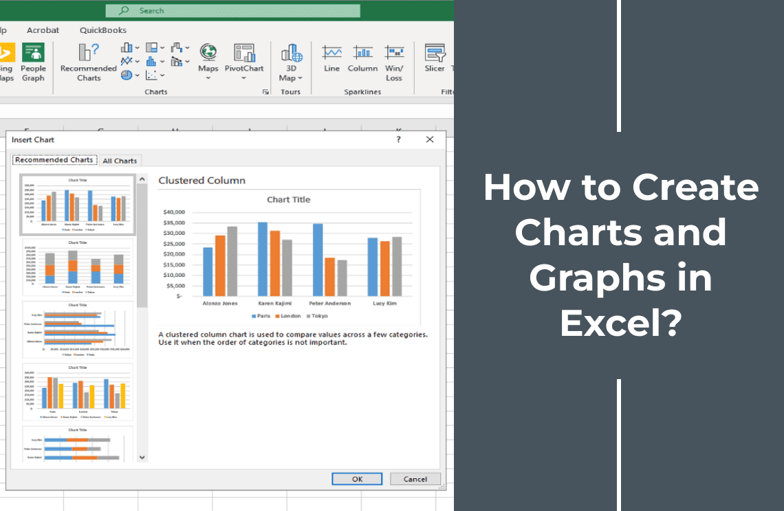
2. Choose Your Chart Type: Go to the "Insert" tab on the Excel ribbon to find the "Charts" group. And then, click on a chart-type shortcut (e.g., Column, Line, Pie) or click "Recommended Charts" for more options. Eventually, select your desired chart type and click “OK.” Thus Microsoft Excel currently offers 18 different chart types. Every chart is designed for specific purposes and with a unique visual layout. Drilling yourself with these chart types can help you choose the most effective way to present your statistics.
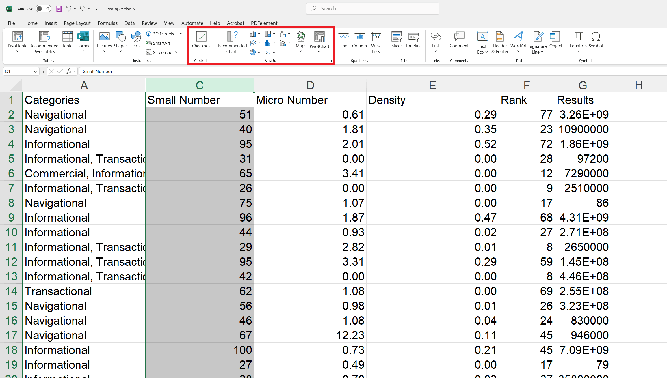
3. Customizing the Appearance of Your Chart: There are different options to tailor your chart look. So, you can enjoy considerable flexibility in modifying its elements to enhance its visual appeal and ensure it effectively conveys your information.
4. Customizing the Data on Your Chart: There are many ways to present your data on your chart or graph. You can adjust the data display. This flexibility effectively communicate your visions.
5. Exporting Your Chart: Copy the chart and paste it into other applications (Word, PowerPoint) or save it as an image or PDF.
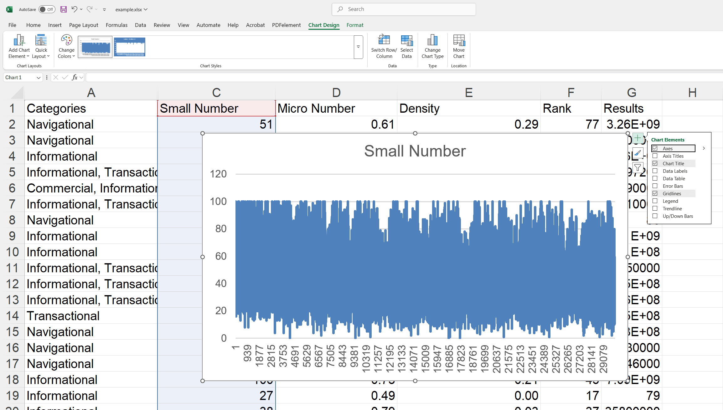
How to Change the Chart Type in Excel?
1. Select Chart: Click on an empty area of the chart to select it.
2. Open Change Chart Type: Go to the "Chart Design" tab, then click "Change Chart Type" in the "Type" group, Or, right-click the chart and select “Change Chart Type.”
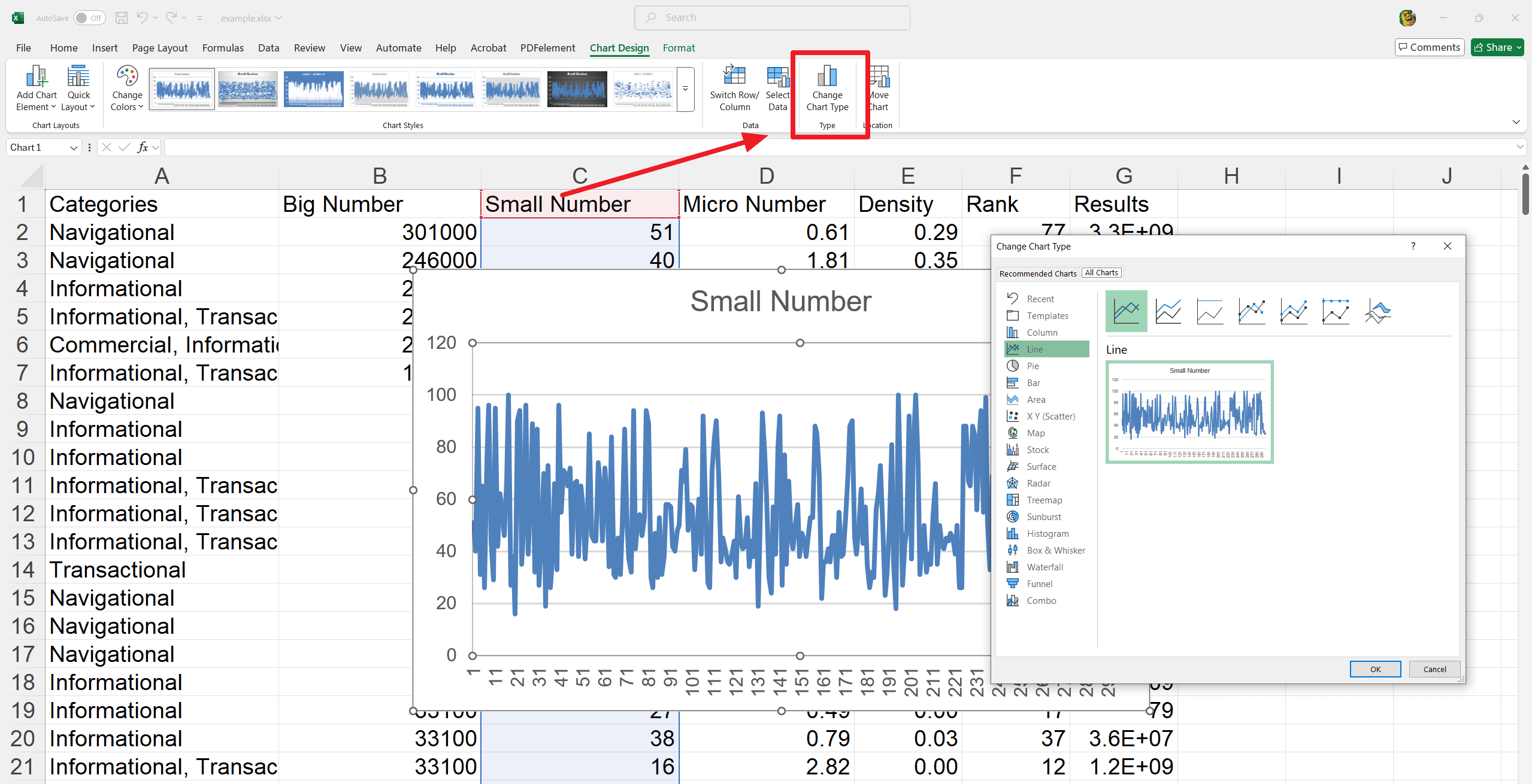
3. Choose New Chart: Select your desired chart type from the list and preview it.
4. Apply Change: Click "OK" to apply the new chart type.
How to Move and Resize Your Charts?
How to Move a Chart in Excel?
1. Click on an empty area of the chart to highlight its border.
2. Drag the chart to your preferred location.
Substitute: Use the arrow keys on your keyboard to reposition the chart precisely.
How to Resize a Chart in Excel?
1. Tap on an empty area of the chart to reveal the resize pointers.
2. Now drag the corner handles to adjust the overall size. You can also use the side handles for horizontal and vertical tunings.
How to Add a Title to a Chart in Excel?
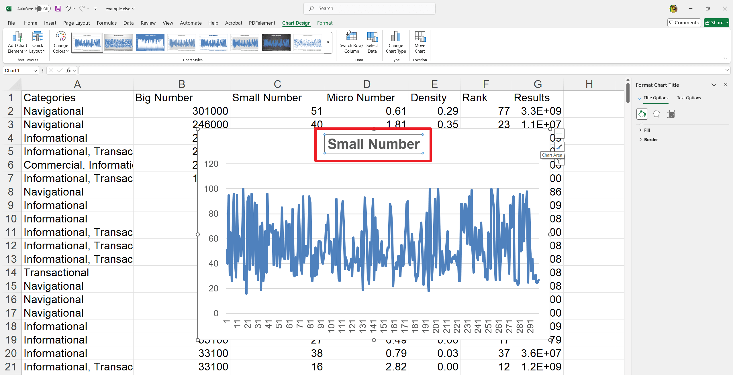
1. Add Title: Click on the "Chart Title" placeholder text in your chart.
2. Type Title: Type your desired title.
3. Format Title (Optional): Double-click the title area. Use the formatting options that appear to:
- Resize or move the title.
- Change the font, size, or color.
- Apply bold, italics, or underline.
- Adjust text alignment.
How to Add a Legend to a Chart in Excel?
1. Select Chart: Click on the chart to select it.
2. Open Chart Elements: Click the "+" (Chart Elements) button next to the chart.
3. Add Legend: Check the "Legend" box.
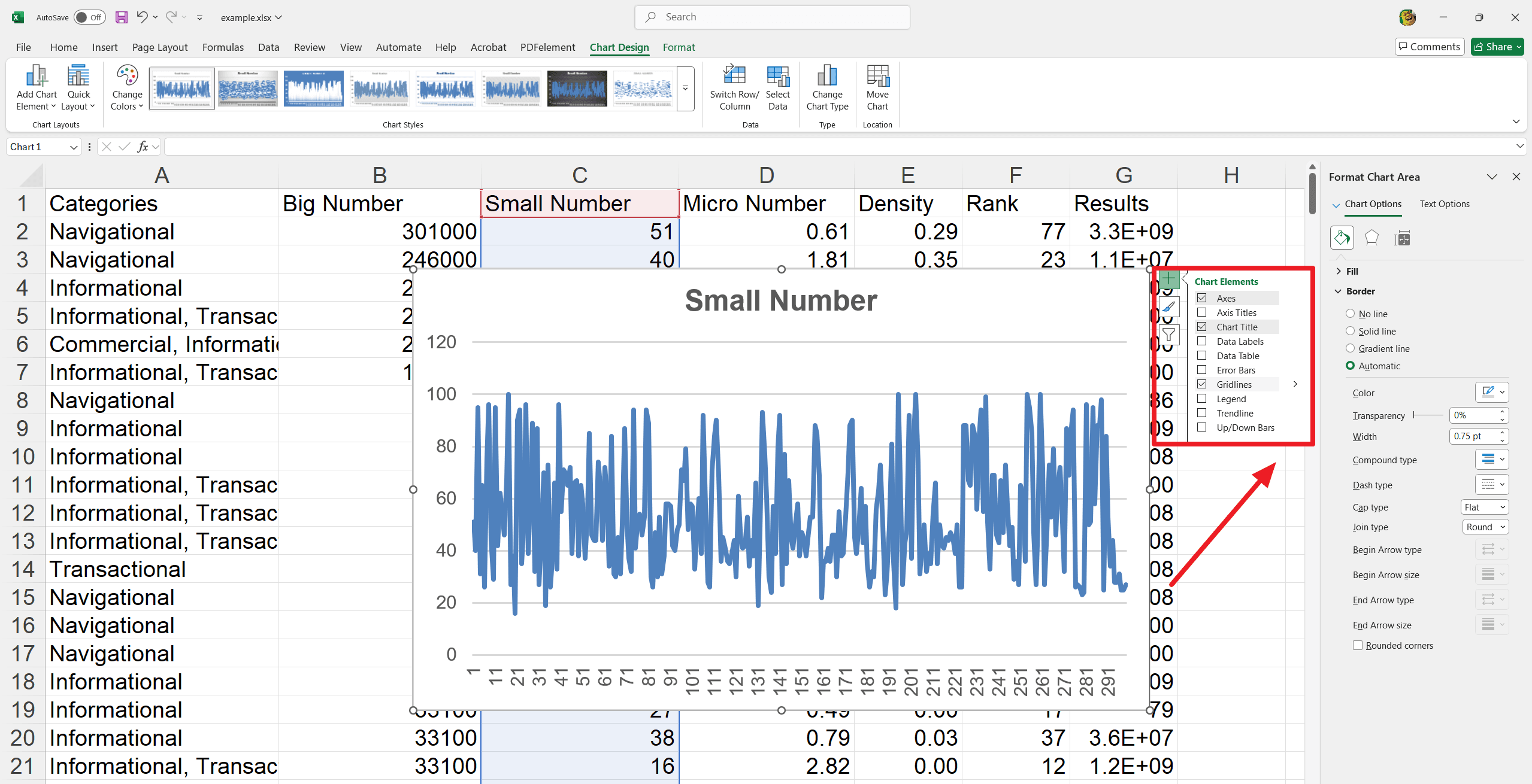
4. Position Legend (Optional): Click the arrow next to "Legend" and choose where you want it (Right, Left, Top, Bottom).
5. Format Legend (Optional): Click "More Options" in the Legend menu. Use the formatting panel to customize the legend's appearance (fill, borders, text, etc.).
How to Add Axis Labels to an Excel Chart?
1. Select Chart: Click on a blank chart area.
2. Open Chart Elements: Click the Chart Elements button (plus sign) next to the chart.
3. Enable Axis Titles: Check Axis Titles in the Chart Elements menu.
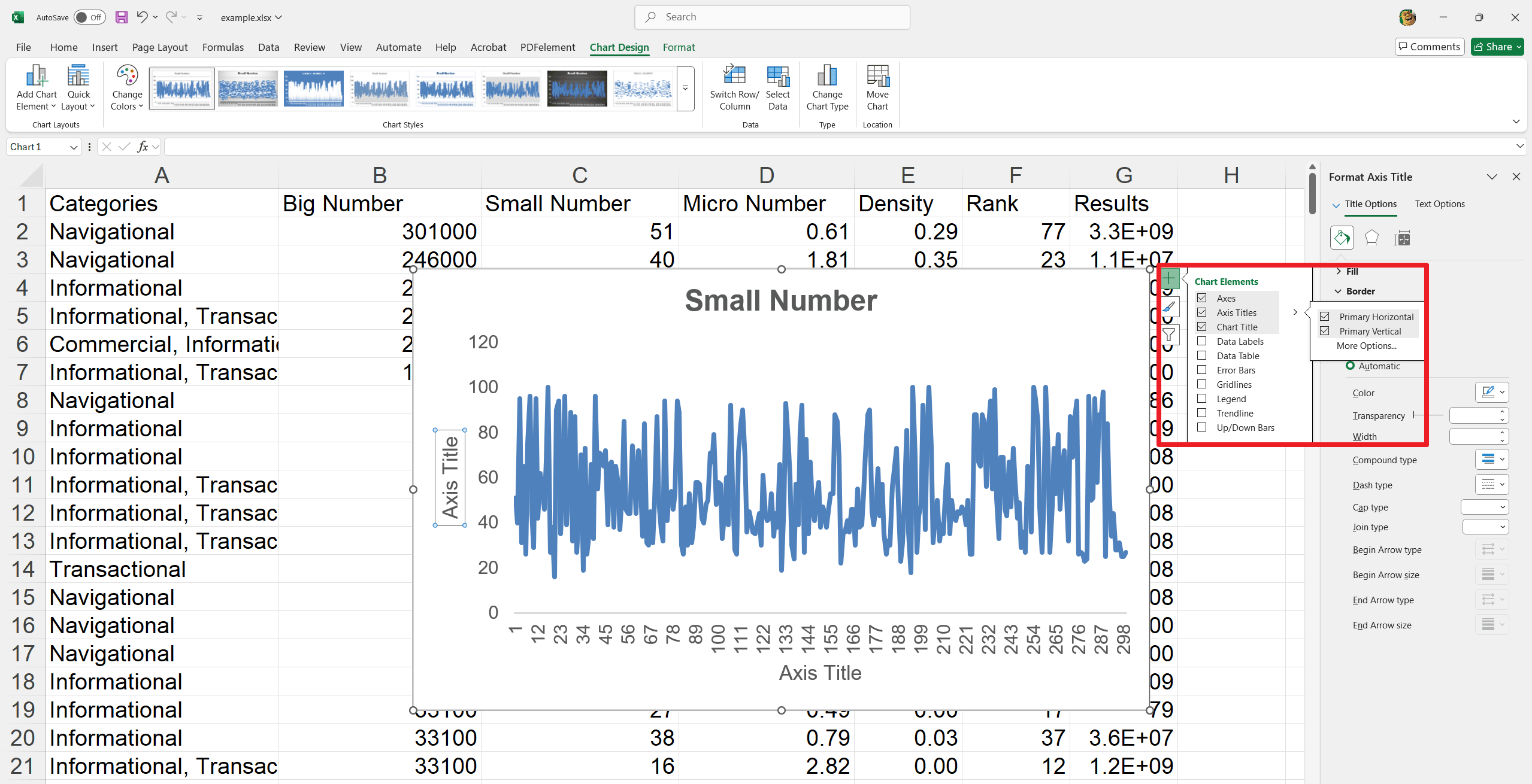
4. Enter Titles: Double-click on the axis title area and type in your labels.
5. Format Titles: Access more formatting options by clicking the arrow next to Axis Titles.
6. Remove Titles: Uncheck Axis Titles in the Chart Elements menu to remove them.
How to Create Trendlines in Excel Charts?
1. Select Chart: Click on your chart to select it.
2. Open Chart Elements: Click the "+" (Chart Elements) button next to the chart.
3. Add Trendline: Check the "Trendline" box.
4. Choose Trendline Type: Click the arrow next to "Trendline" and select the type you want (e.g., Linear, Exponential).
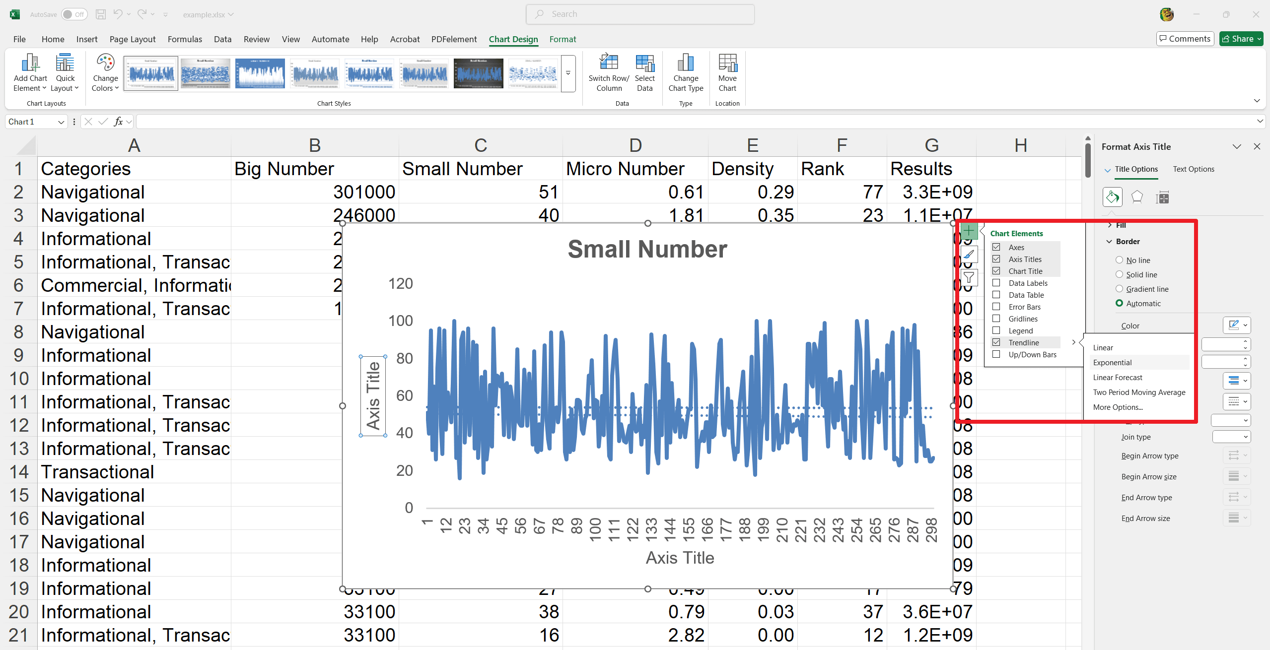
5. Format Trendline (Optional):
- Click "More Options" to open the "Format Trendline" panel.
- Adjust line style, add shadows, or other effects.
6. Adjust Settings (Optional):
In the "Format Trendline" panel, change settings like forecasting or display the trendline's equation.
How to Make Your Chart Dynamic and Interactive?
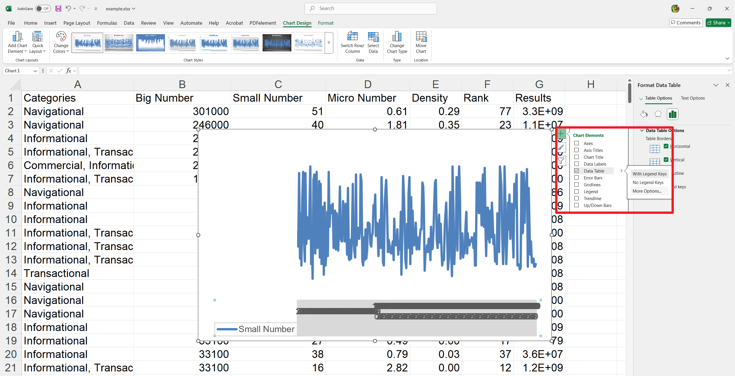
Adding a Data Table:
1. Select the Chart: Click anywhere within the chart's border.
2. Open Chart Elements: Click the "+" (Chart Elements) button that appears near the top-right of the chart.
3. Add Data Table: Check the "Data Table" box.
4. (Optional) Legend Keys: If needed, click the arrow next to "Data Table" and check or uncheck "Legend Keys" to show or hide them.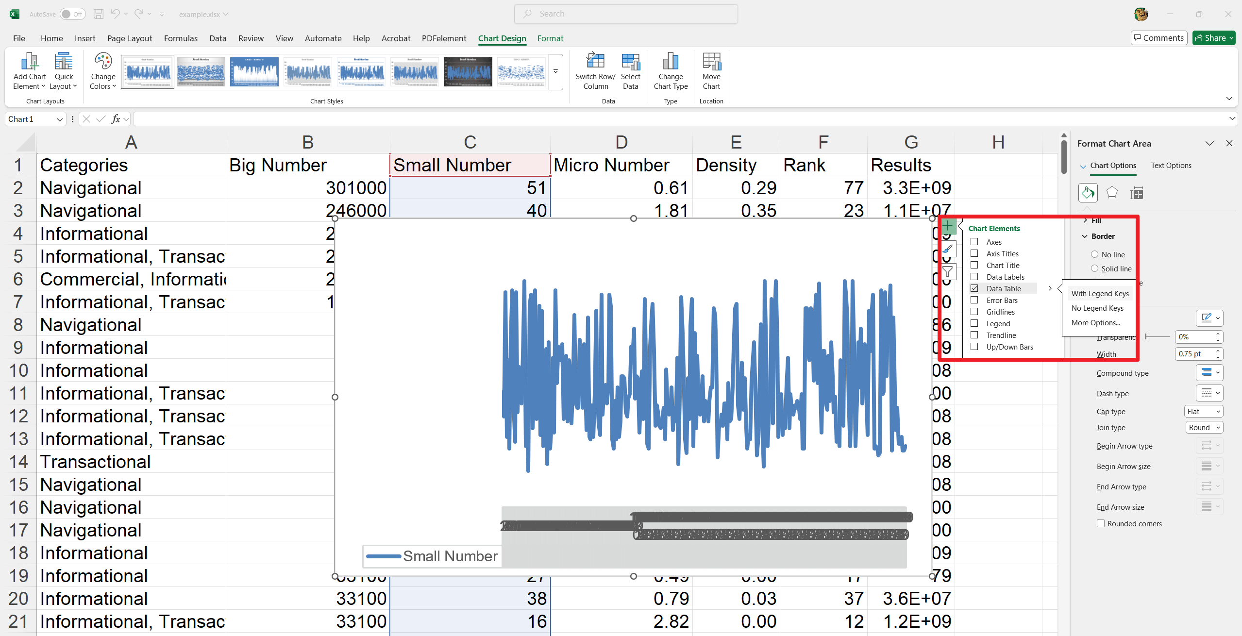
Formatting the Data Table:
1. Open Formatting Options: Click the arrow next to "Data Table" in the Chart Elements menu, and then select “More Options.”
2. Customize: In the "Format Data Table" panel, you can adjust:
- Fill color
- Border styles
- Shadows and glows
- 3D effects
- Table border properties
Removing a Data Table:
Open Chart Elements: Click the "+" (Chart Elements) button.
Remove Data Table: Uncheck the "Data Table" box.
Interactive Charts - Adding Slicers to a Chart for user-friendly filtering
1. Select the Chart: Click on your chart.
2. Insert Slicer: Go to the "Analyze" tab (which appears when the chart is selected) and click “Insert Slicer.”
3. Choose Filter Fields: In the "Insert Slicers" dialog box, select the data fields you want to use as filters and click “OK.”
4. (Optional) Clean Up: Hide the chart's built-in filter buttons to avoid redundancy. Resize the chart area to neatly accommodate the slicers.
Creating a Combination Chart in Excel
A combination chart integrates two or more chart types into a single insight. Follow these steps to make a combination chart:
How to Create a Combination Chart in Excel
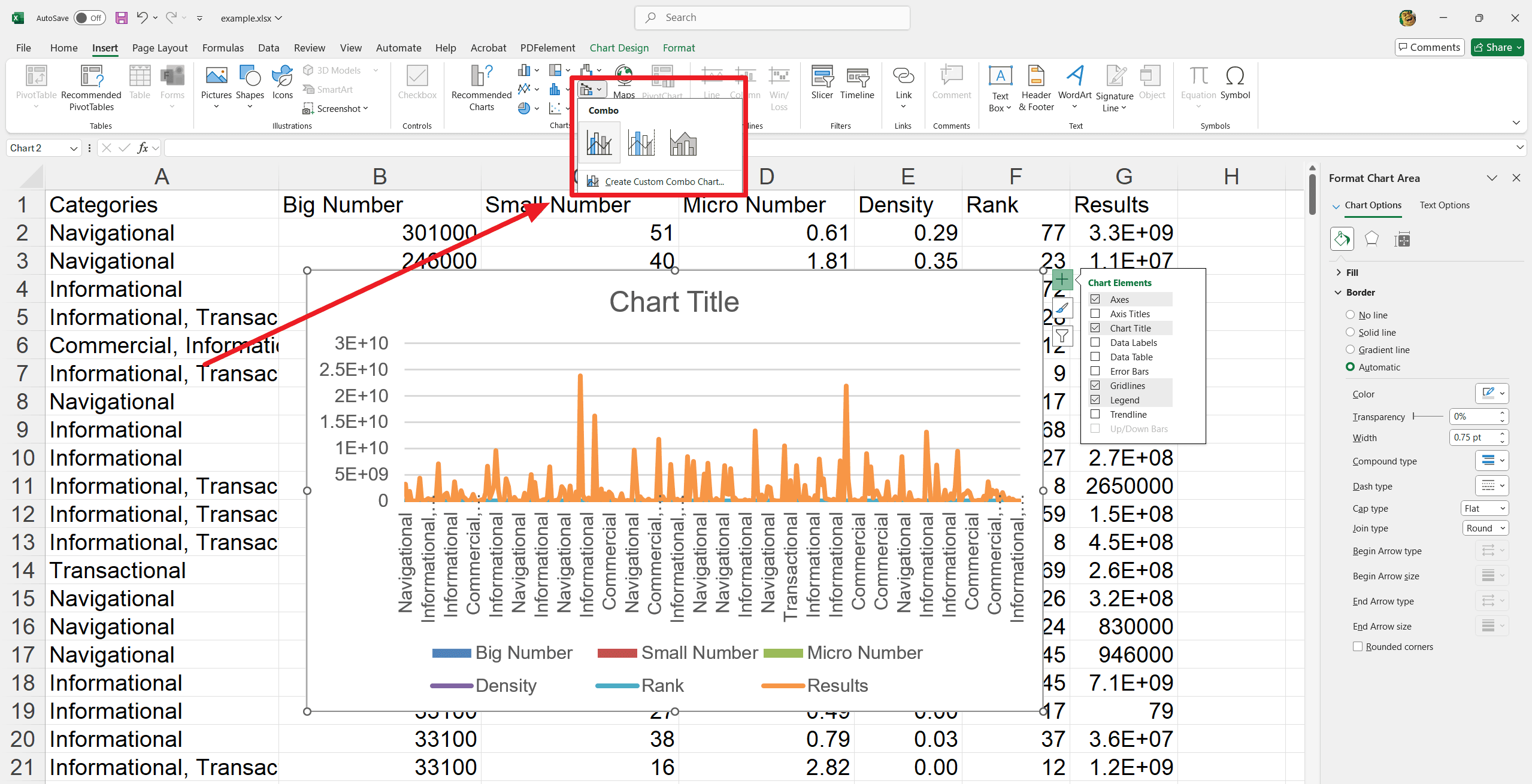
1. Select Data: Select the data range you want to chart.
2. Insert Combo Chart: Go to the "Insert" tab, and in the "Charts" group, click the "Combo" chart icon (or "Insert Combo Chart").
3. Customize Combo Chart: Choose “Create Custom Combo Chart.” In the "Insert Combo Chart" dialog box, select the desired chart type for each data series (e.g., clustered column, line). Thereafter, click “OK.”
4. Add Axis Titles (Optional): Click on the chart. Then, click the "+" (Chart Elements) button. Check “Axis Titles.” Click on each axis title to edit and type in a descriptive name.
Introduction to Different Types of Charts in Excel
Microsoft Excel features 18 distinct chart types for users. Each chart type is designed with a unique appearance and serves its specific function. In the beginning section we have discussed the types of charts available in Excel sheets. Let us focus on them and understand their uses and features.
1. Clustered Column Chart
A clustered Column Chart is an effective tool in Excel for comparing values across multiple classifications. This chart organizes data into vertical columns and make it easy to visualize differences and trends at a look. It is beneficial in business reports and presentation purposes.
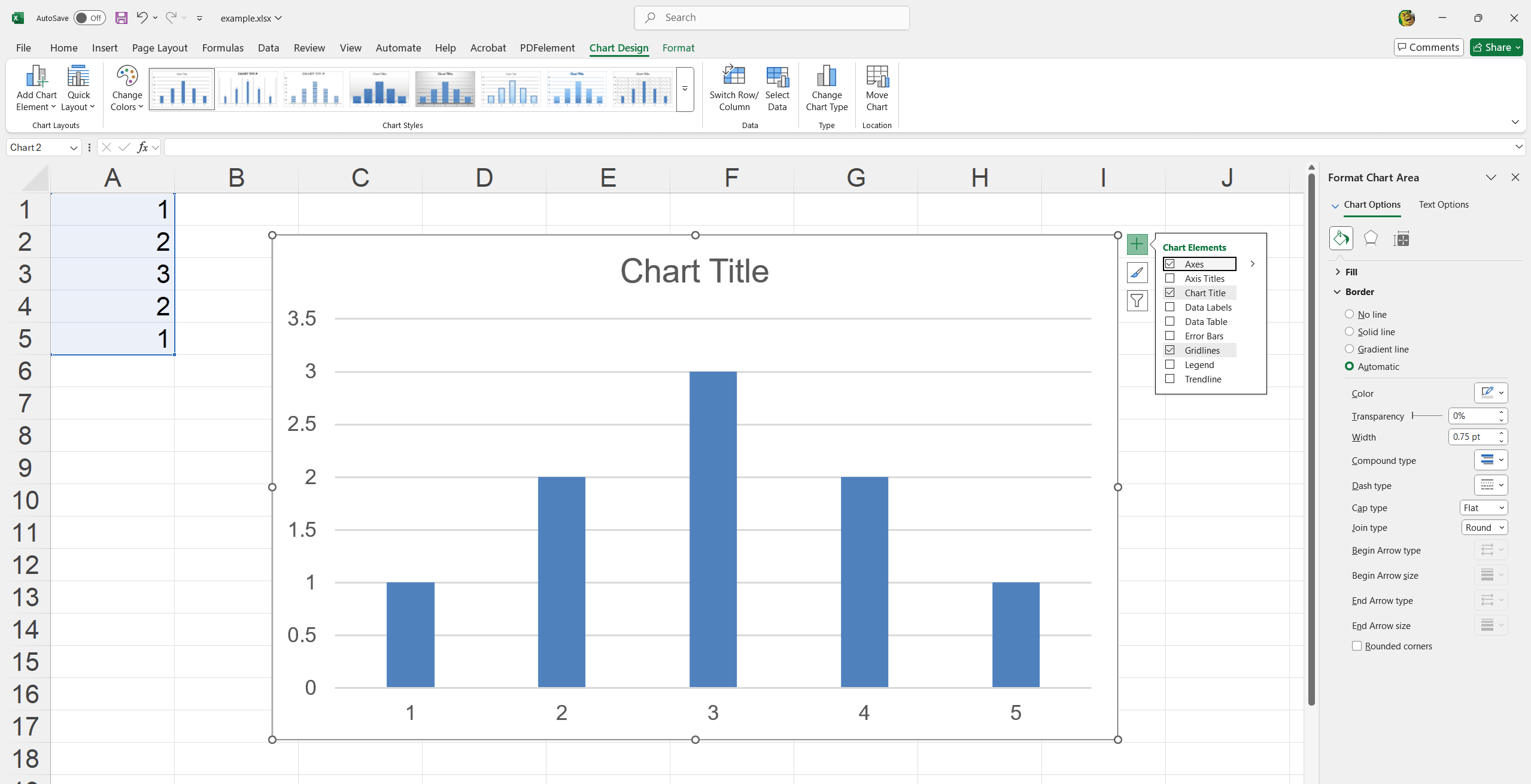
- Compare sales performance across different regions.
- Analyze year-over-year growth for multiple products.
- Track departmental expenses across various months.
2. Line Graph
A Line Graph is a powerful tool in Excel for visualizing data trends over time. Linking data points with a continuous line clearly shows changes and patterns. It is ideal for performance tracking and forecasting in business surroundings.
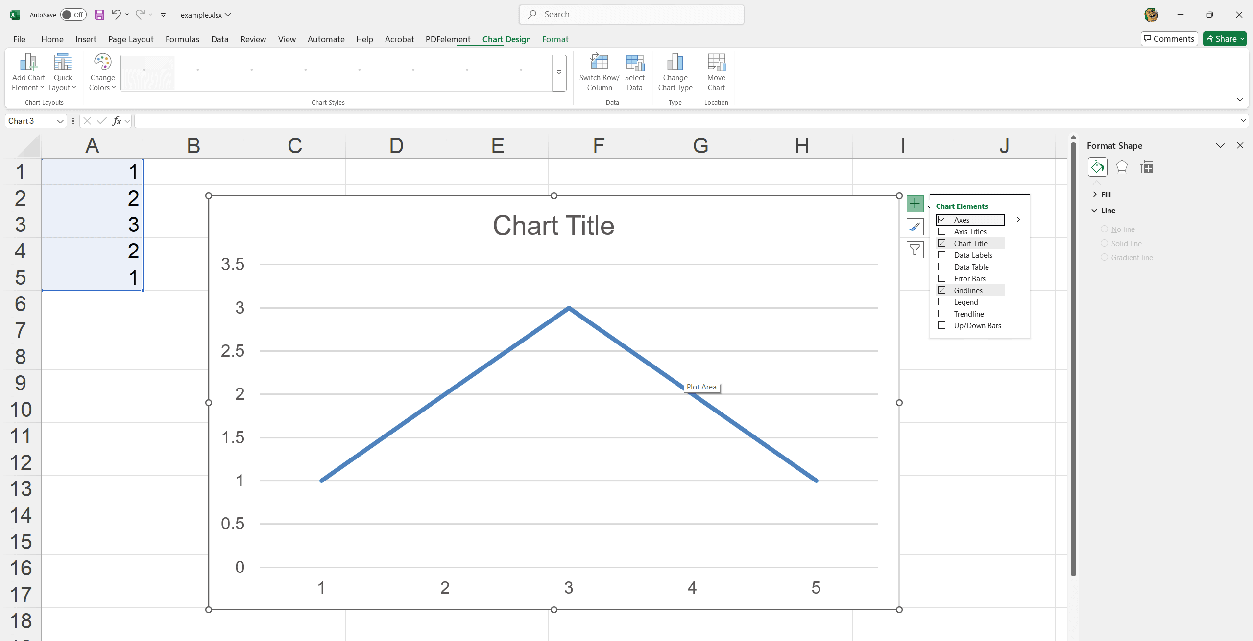
- You can monitor monthly revenue trends over the fiscal time.
- Track employee productivity rates over quarters.
- Analyze stock price movements over time.
3. Pie Chart
Pie Chart is a useful visual aid in Excel for illustrating the whole proportions. However, it divides a circle into slices to represent data segments. It is easy to quickly grasp parts of a dataset in relation completely. Best for simple comparisons and highlighting key points in documents.
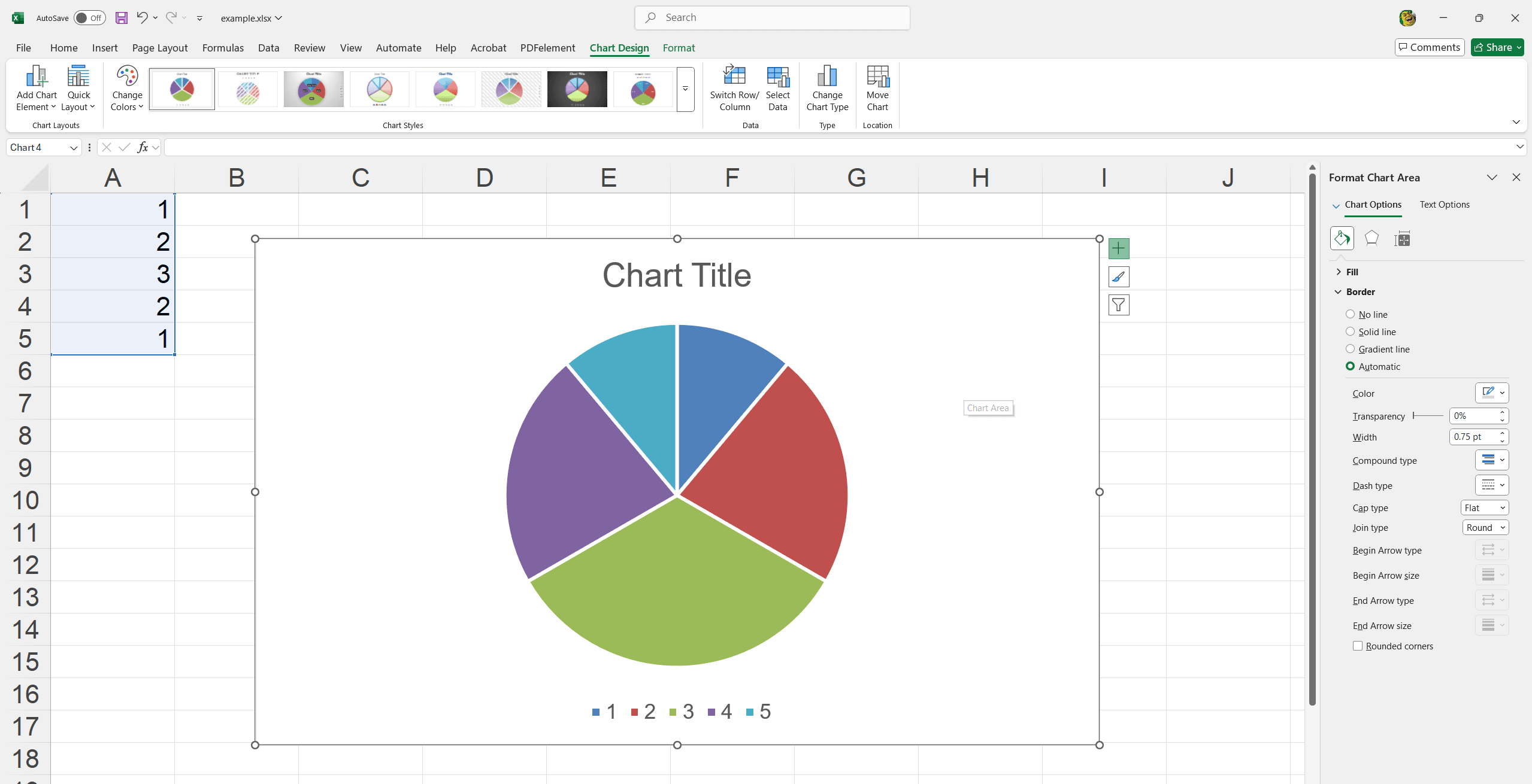
- Display the market share of different products.
- Show the distribution of expenses within a budget.
- Visualize the percentage contribution of each team to a project.
4. Clustered Bar Chart
Excel Clustered Bar Chart is effective for comparing values across categories using bars horizontally. It is particularly useful for highlighting differences in data groups and make information easy to interpret during team meetings, reports and analysis.
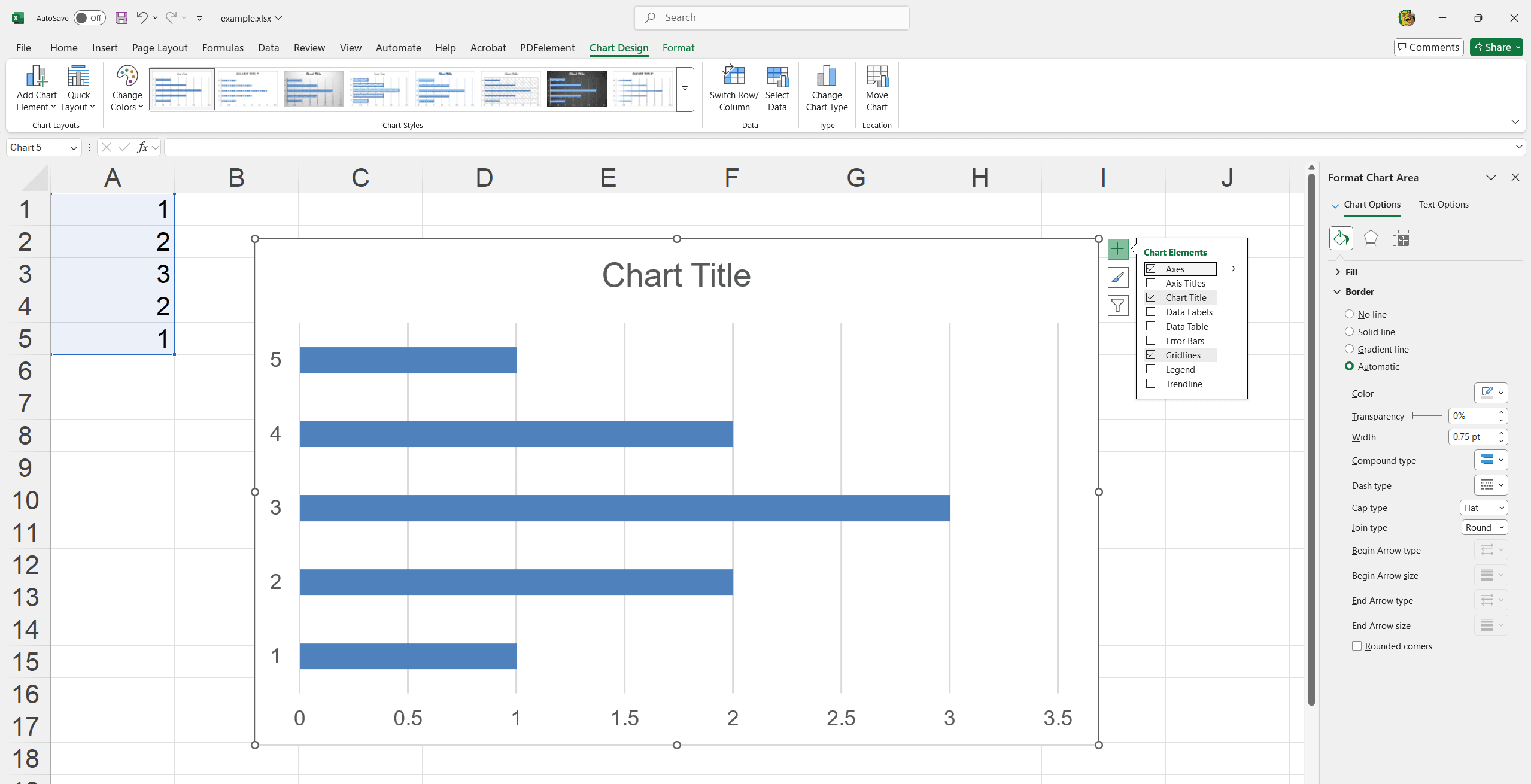
- Compare employee performance across different departments.
- Analyze customer feedback across multiple product lines.
- Evaluate budget allocations across various projects.
5. Area Chart
Excel Area Chart is ideal for displaying cumulative data trends over time with visually impactful filled areas. It makes overall trends and volume easier to understand.
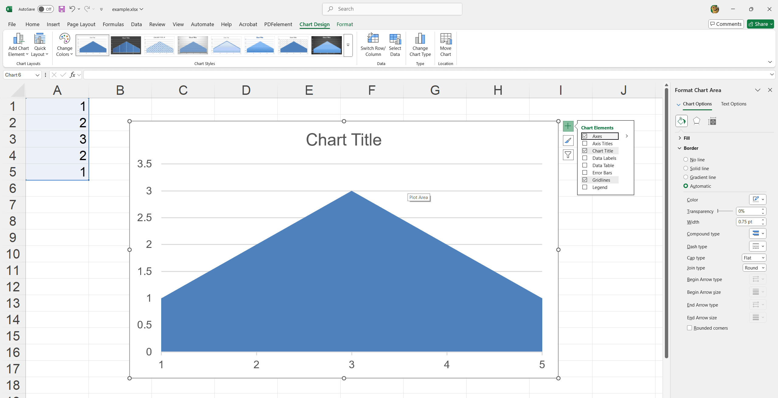
- Track cumulative sales over the year.
- Compare revenue and expenses over quarters.
- Visualize market growth of different segments.
6. Scatter Chart
Excel Scatter Chart visualizes relationships between two variables perfectly. However, it plots data points on the X and Y axes to identify datasets’ correlations and patterns.
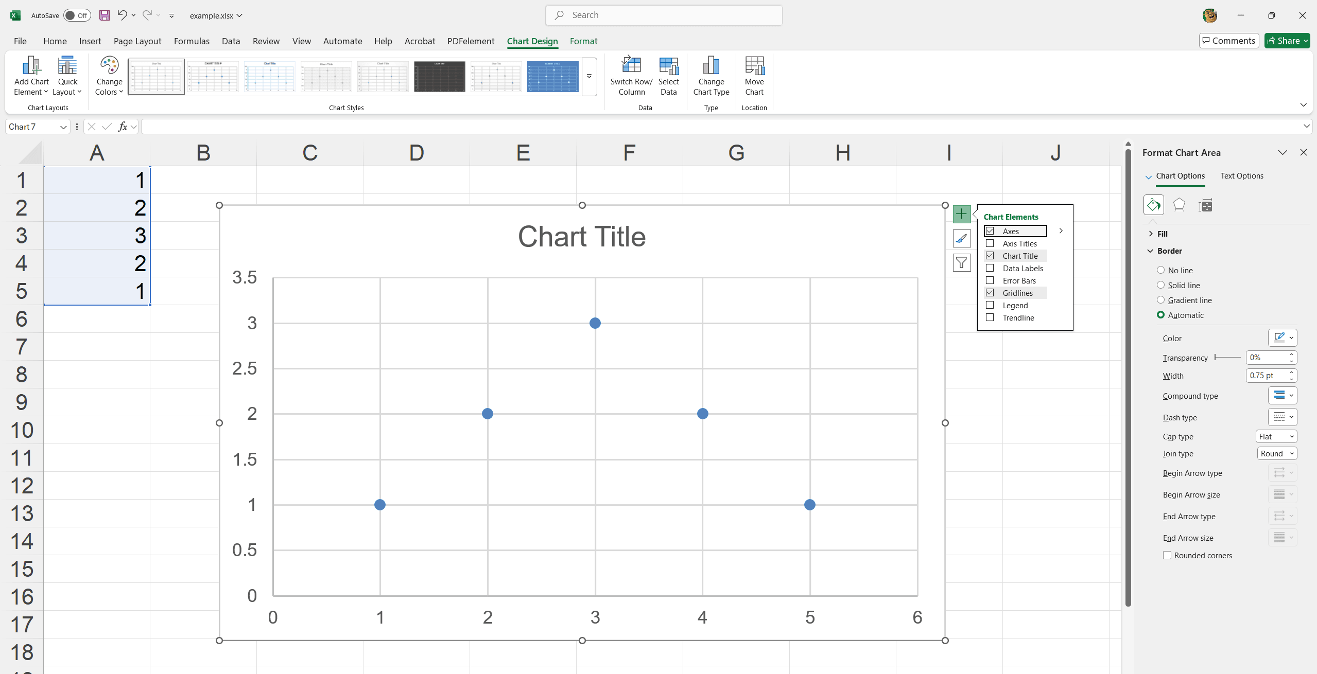
- Analyze the relationship between advertising spend and sales.
- Examine trends in employee performance and training hours.
- Investigate correlations between customer satisfaction and response time.
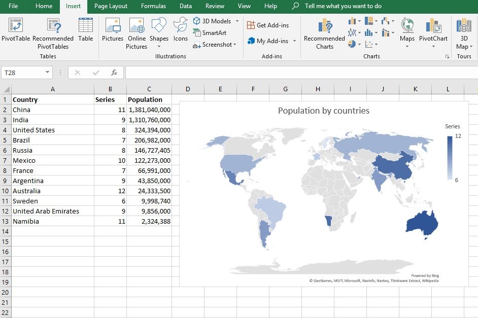
7. Filled Map Chart
A Filled Map Chart in Excel visually represents data distributions across geographical regions using color-coded areas. It's excellent for identifying regional trends and variations in datasets.
- Display sales performance across different territories.
- Highlight the distribution of customer demographics by location.
- Visualize regional contributions to overall revenue.
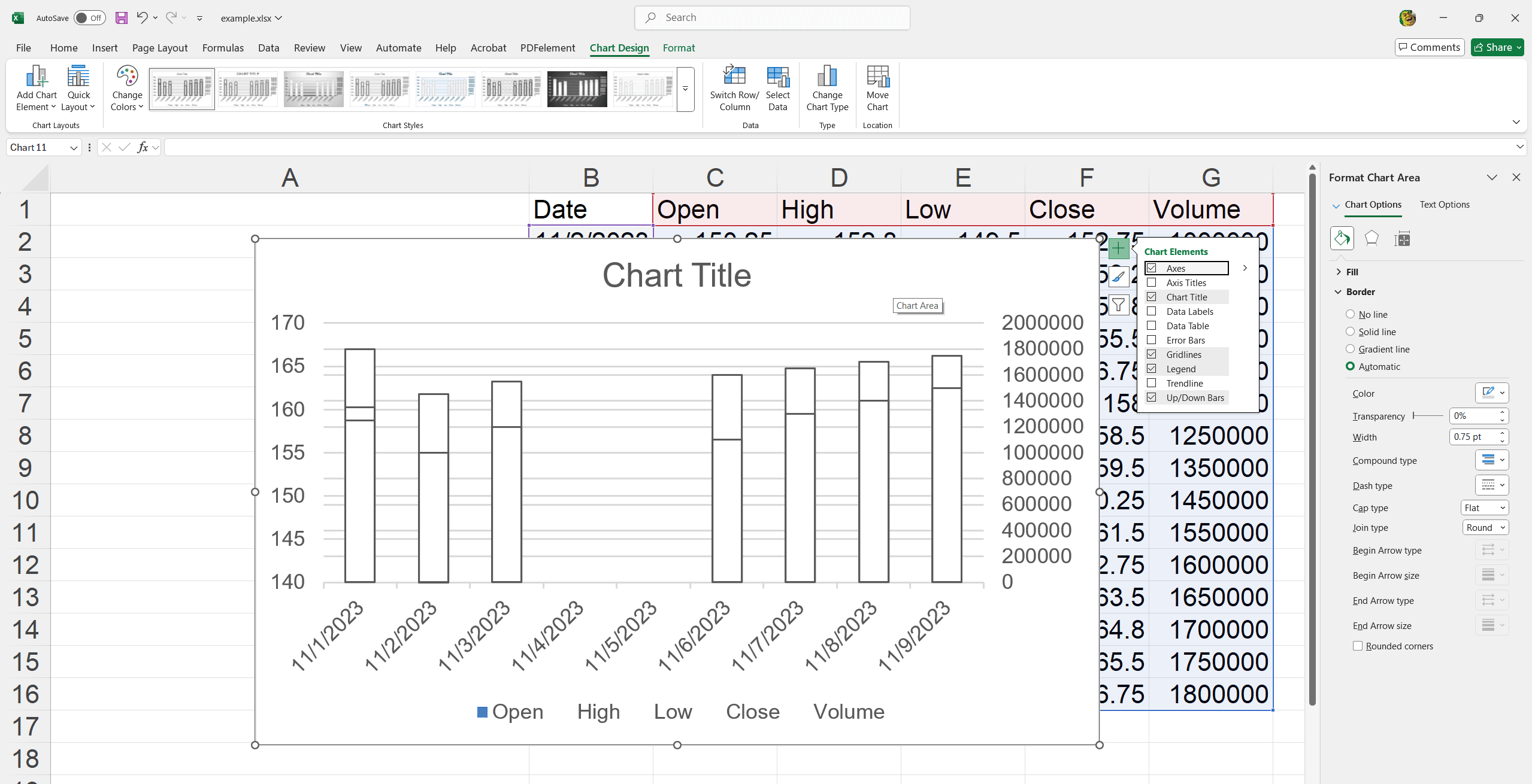
8. Stock Chart
A Stock Chart in Excel tracks and visualizes stock market data such as opening, closing, high, and low prices. It helps analyze and present financial data trends.
- Monitor daily stock market performance.
- Compare historical stock price movements.
- Analyze financial data for investment decisions.
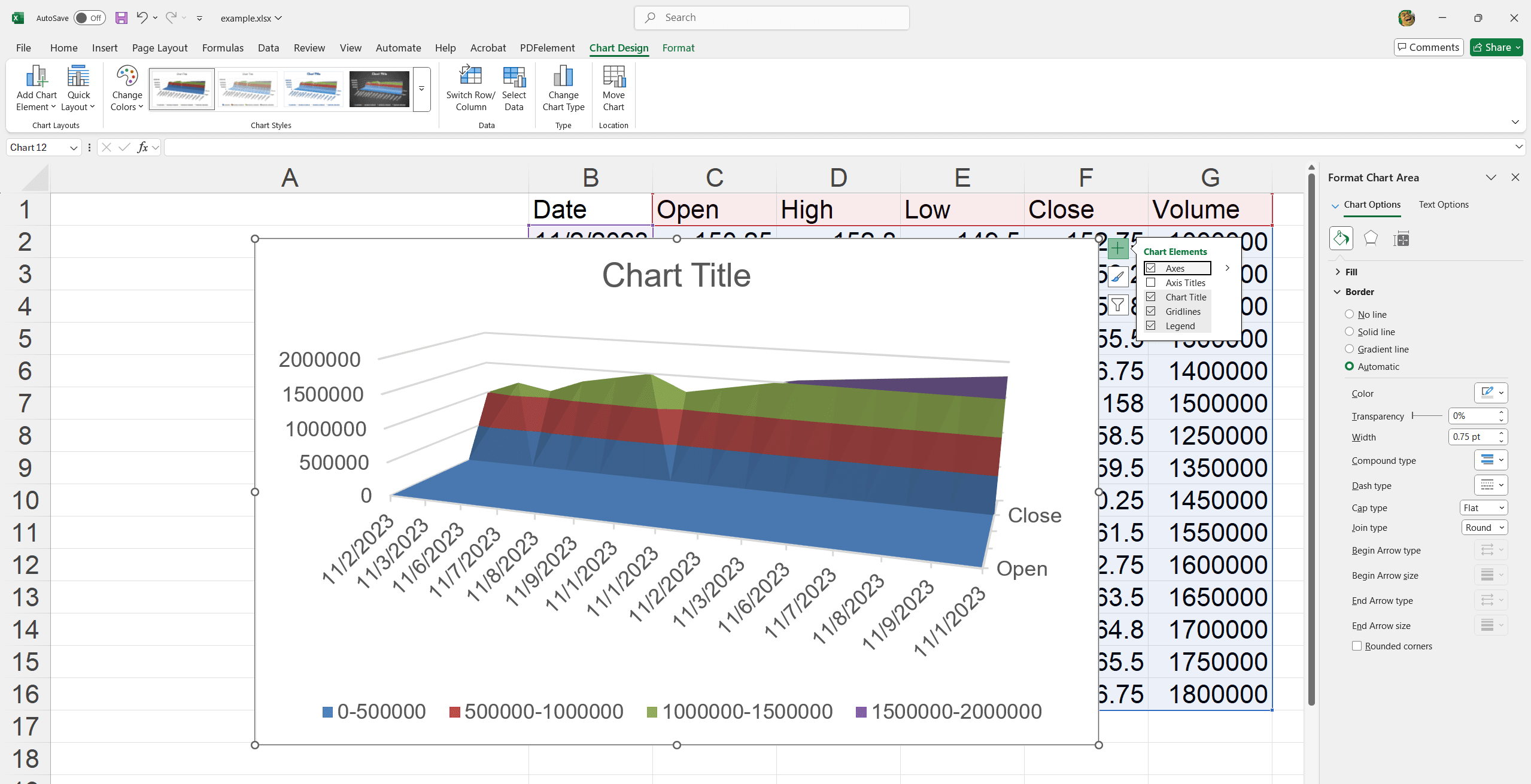
9. Surface Chart
A Surface Chart in Excel is used to find the optimum combinations between two data sets. It displays a 3D view of data points where colors and patterns represent different value ranges.
- Visualize product performance under various conditions.
- Analyze interaction effects in a multi-variable experiment.
- Identify optimal pricing and production levels.
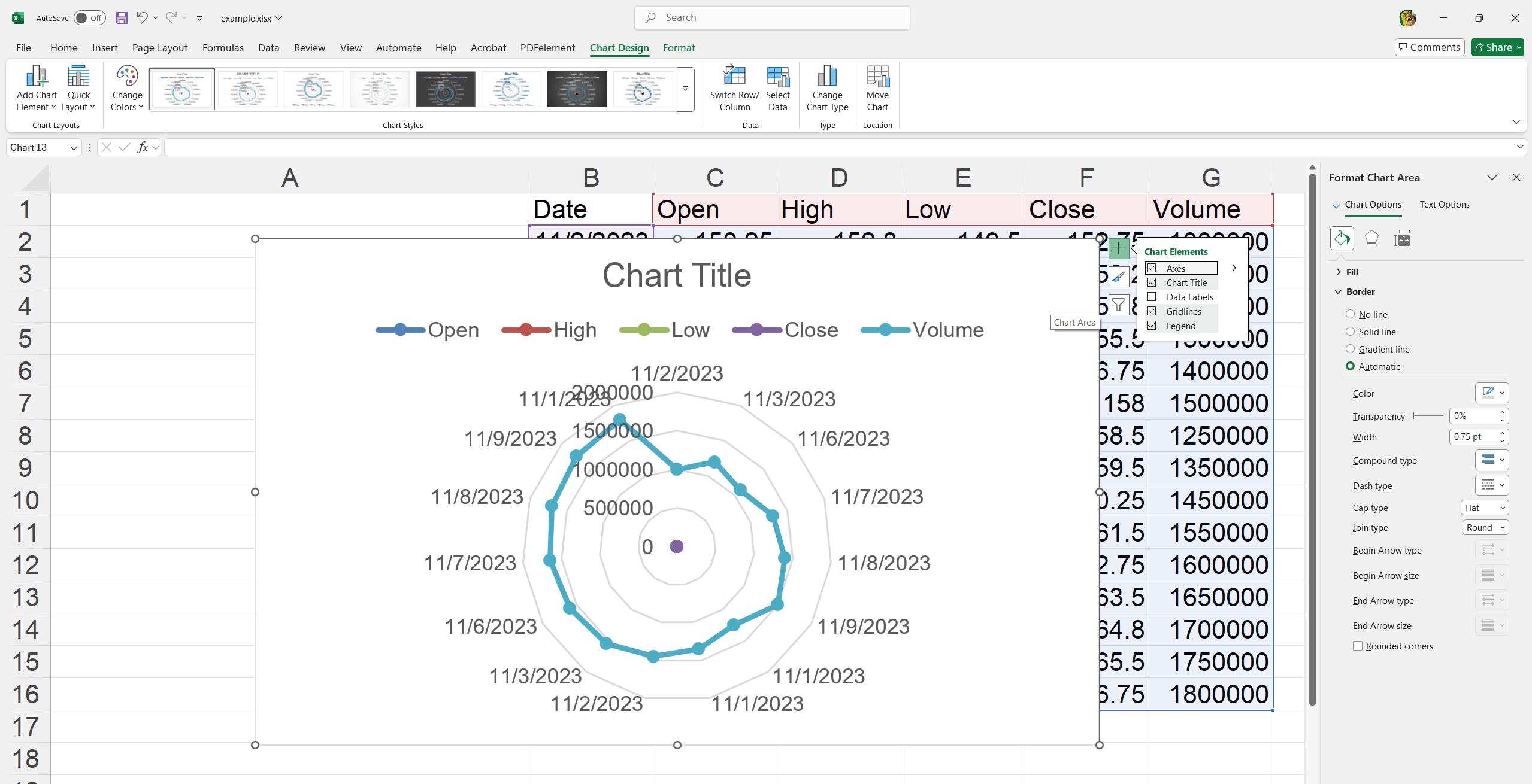
10. Radar Chart
A Radar Chart in Excel is ideal for comparing multiple variables and displaying performance metrics. It plots data points on axes starting from the same point, making it easy to observe variances and patterns.
- Compare employee skill sets across different competencies.
- Evaluate product features against competitors.
- Analyze customer satisfaction metrics across various service aspects.
11. Treemap Chart
A Treemap Chart in Excel visualizes hierarchical data using nested rectangles. It is ideal for effectively showcasing large datasets.
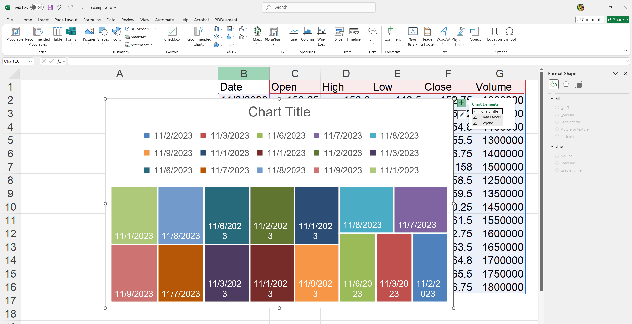
- Analyze sales performance across multiple categories.
- Visualize budget distribution across departments.
- Compare the market share of various brands.
12. Sunburst Chart
A Sunburst Chart in Excel displays hierarchical data as concentric rings, providing clear insights into data relationships and structure.
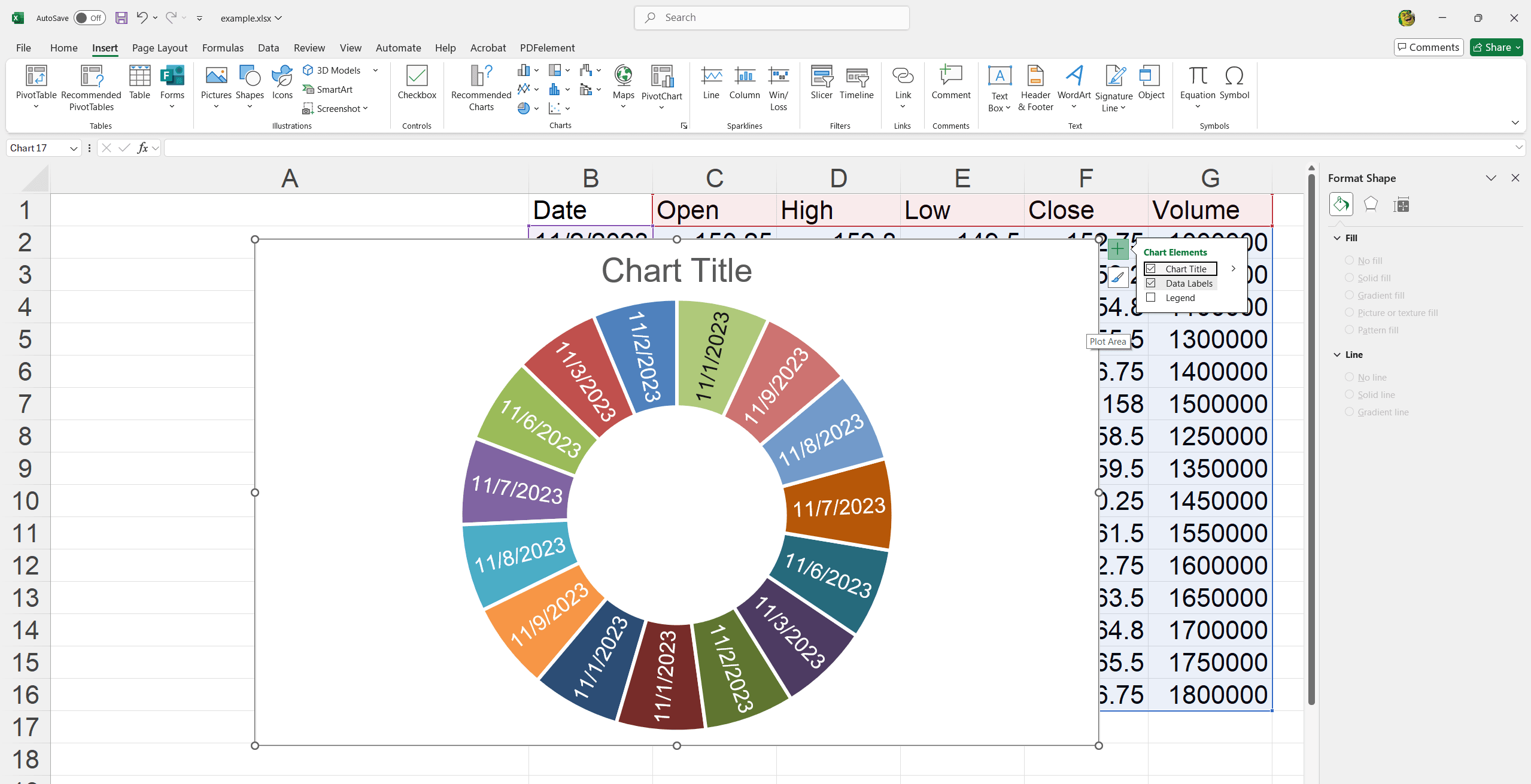
- Analyze organizational hierarchies.
- Visualize project breakdowns by phases and tasks.
- Illustrate customer journey stages in marketing.
13. Histogram Chart
A Histogram Chart in Excel represents the distribution of numerical data, showing the frequency of data points within specified ranges.
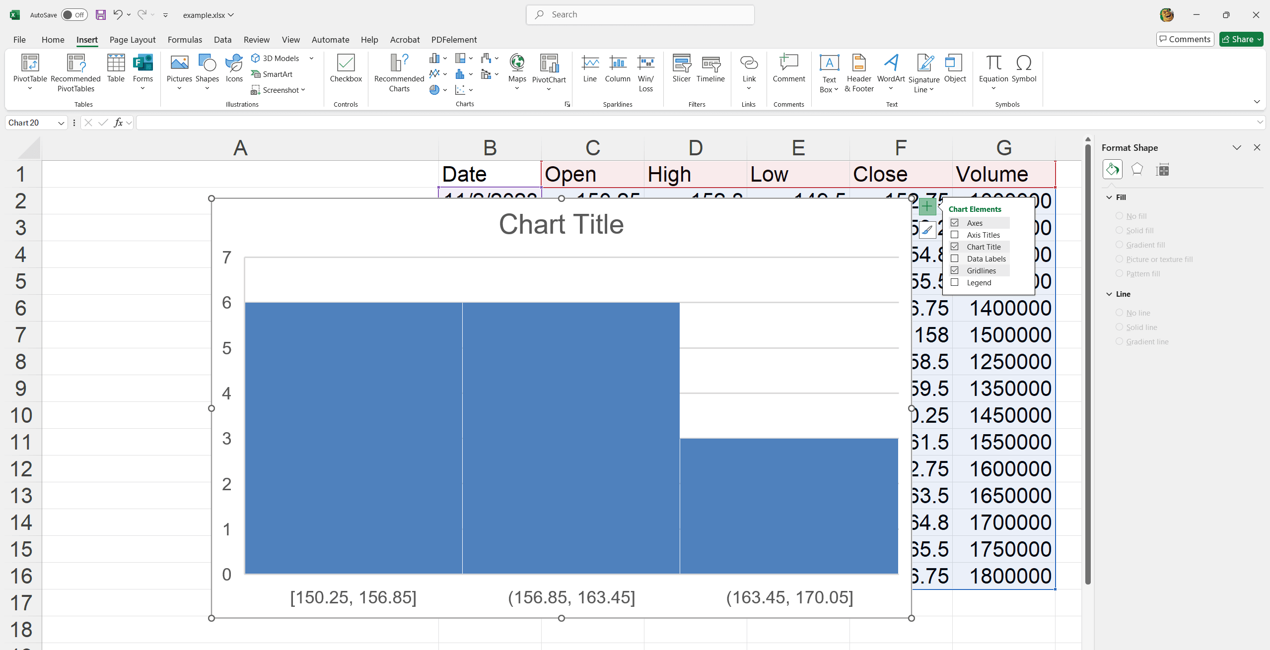
- Analyze employee performance based on assessment scores.
- Understand customer purchase behavior over different price ranges.
- Measure the frequency of defects or issues in a manufacturing process.
14. Pareto Chart
A Pareto Chart in Excel visually emphasizes the most important factors in a dataset, combining bars and a line graph to follow the 80/20 rule.
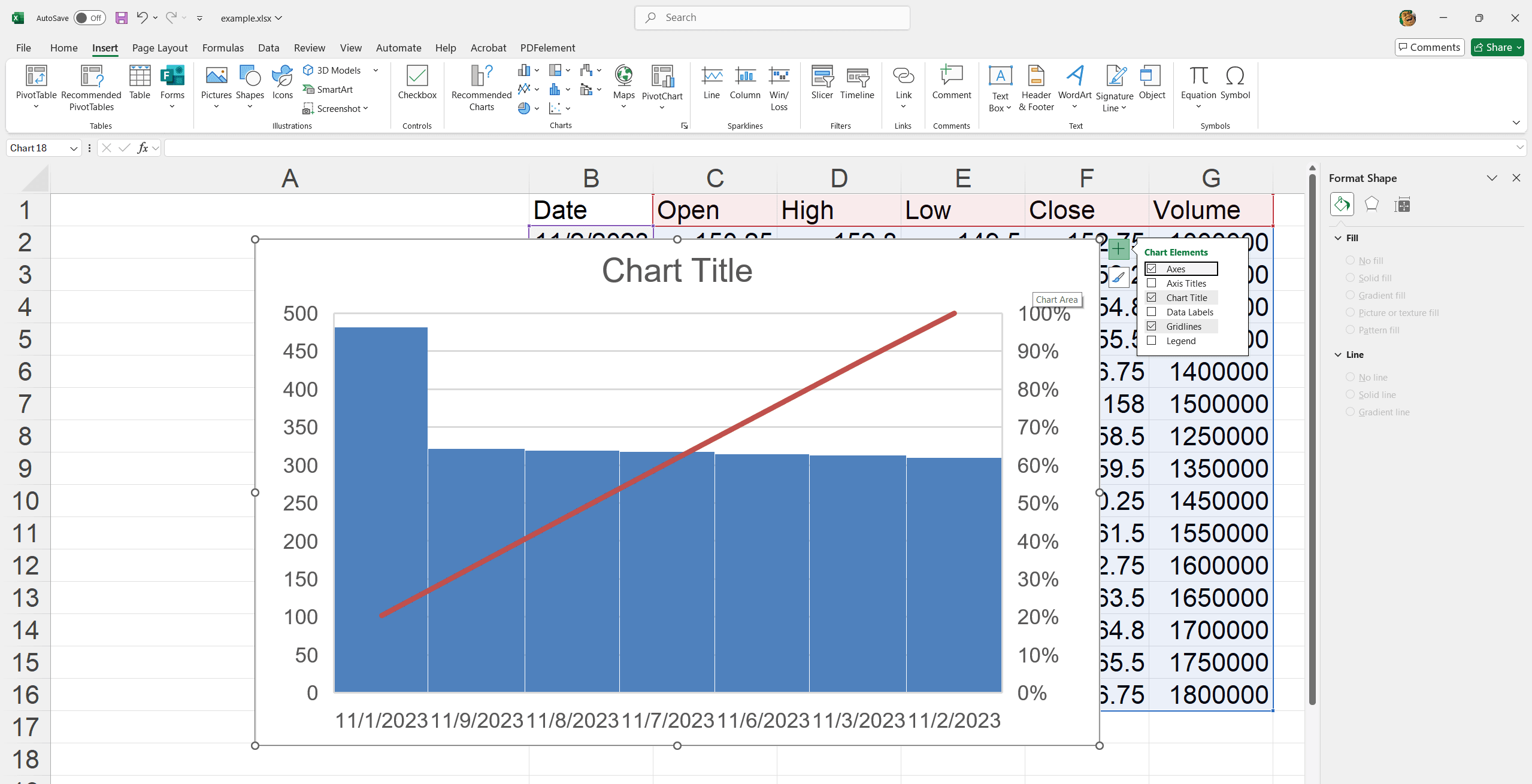
- Prioritize addressing major customer complaints.
- Identify main defects in product quality.
- Determine key areas for cost reduction.
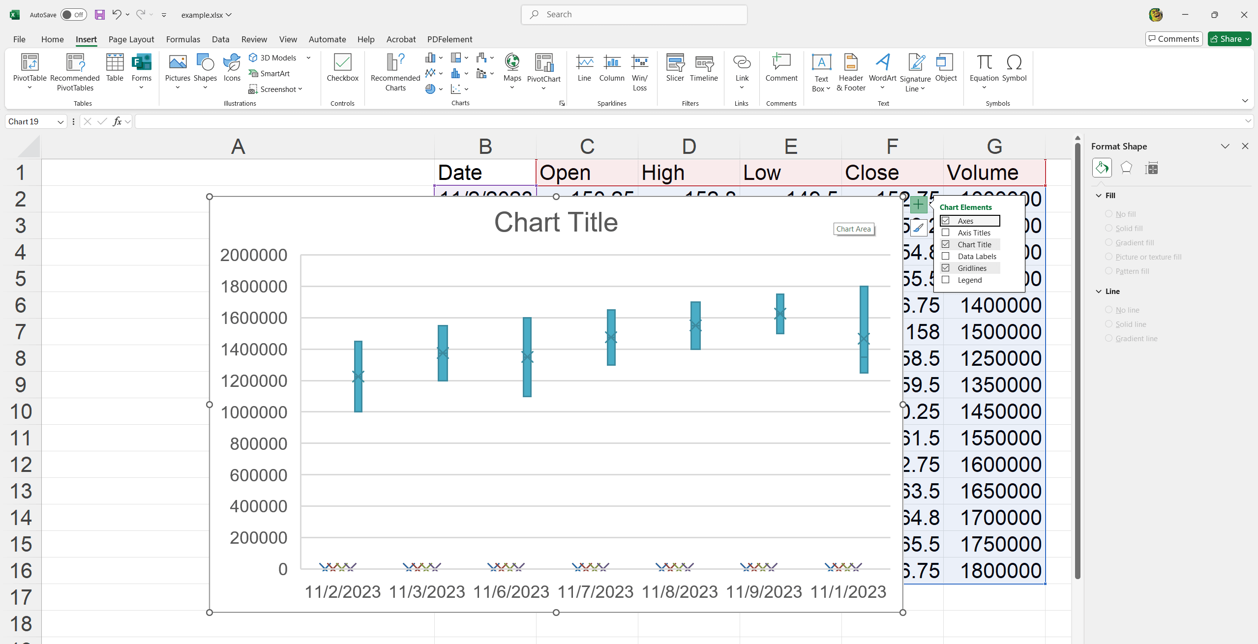
15. Box and Whisker Chart
A Box and Whisker Chart in Excel visualizes data distribution, highlighting quartiles, medians, and outliers, offering insights into variability and central tendencies.
- Analyze employee salary distributions across departments.
- Compare project completion times.
- Evaluate exam scores for different classes.
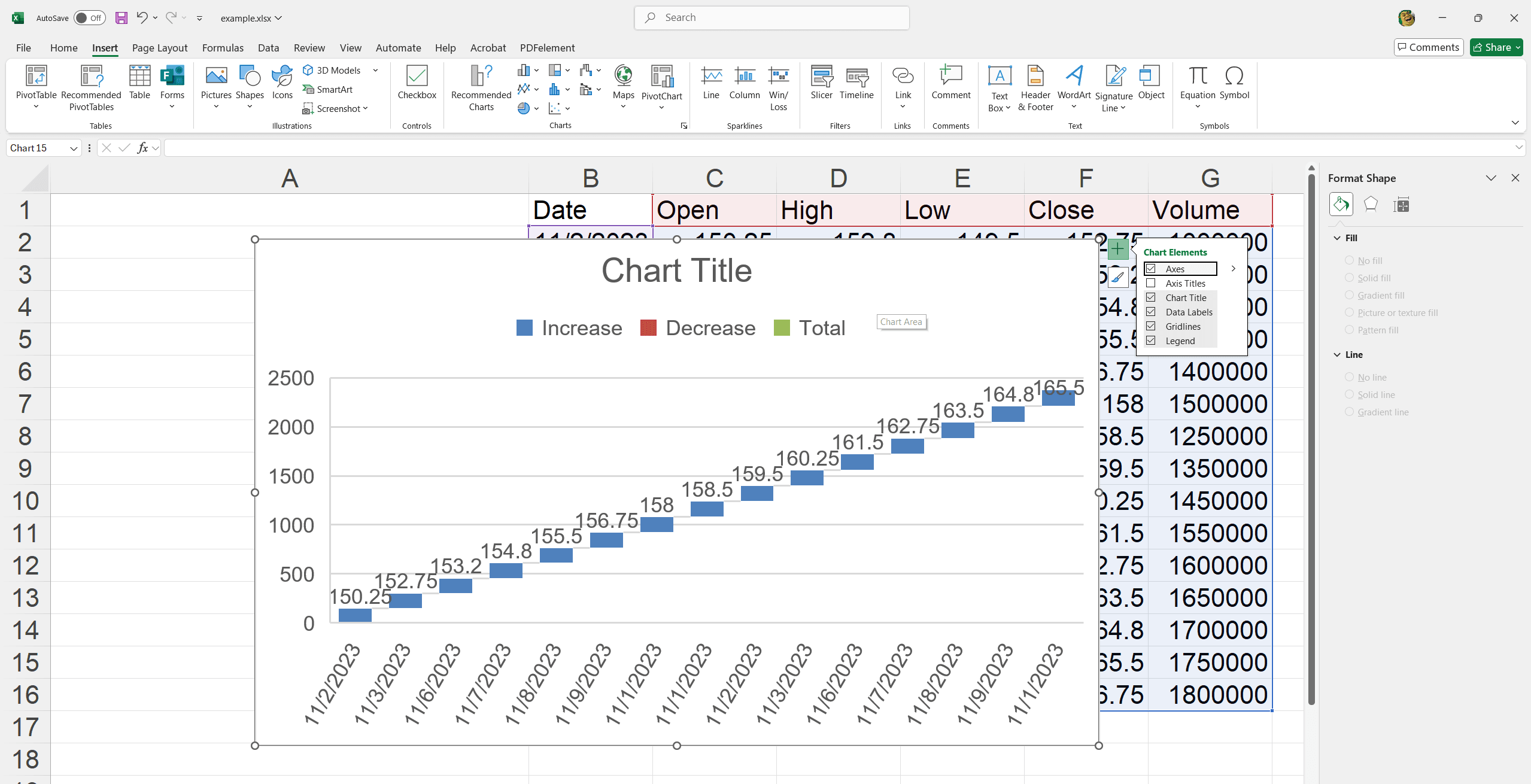
16. Waterfall Chart
A Waterfall Chart in Excel displays the cumulative effect of sequential positive and negative values, useful for understanding the incremental impact on a starting value.
- Track financial statements and profit/loss over time.
- Visualize changes in inventory levels.
- Analyze contributions to project milestones.
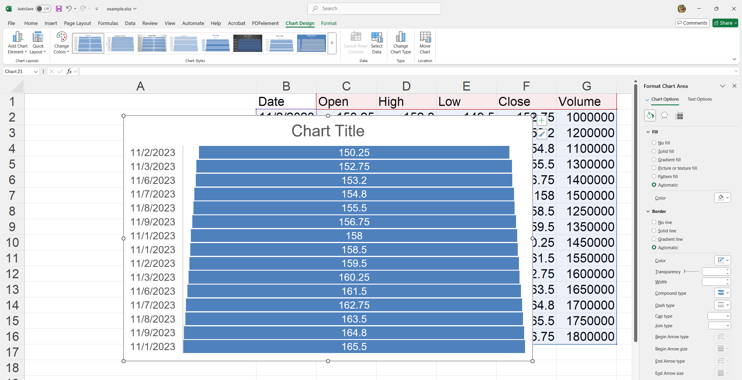
17. Funnel Chart
A Funnel Chart in Excel visualizes stages in a process, highlighting potential drop-offs and identifying areas for improvement by showing values progressively decreasing.
- Track sales leads through the conversion pipeline.
- Analyze recruitment and hiring stages.
- Monitor customer support resolution progress.
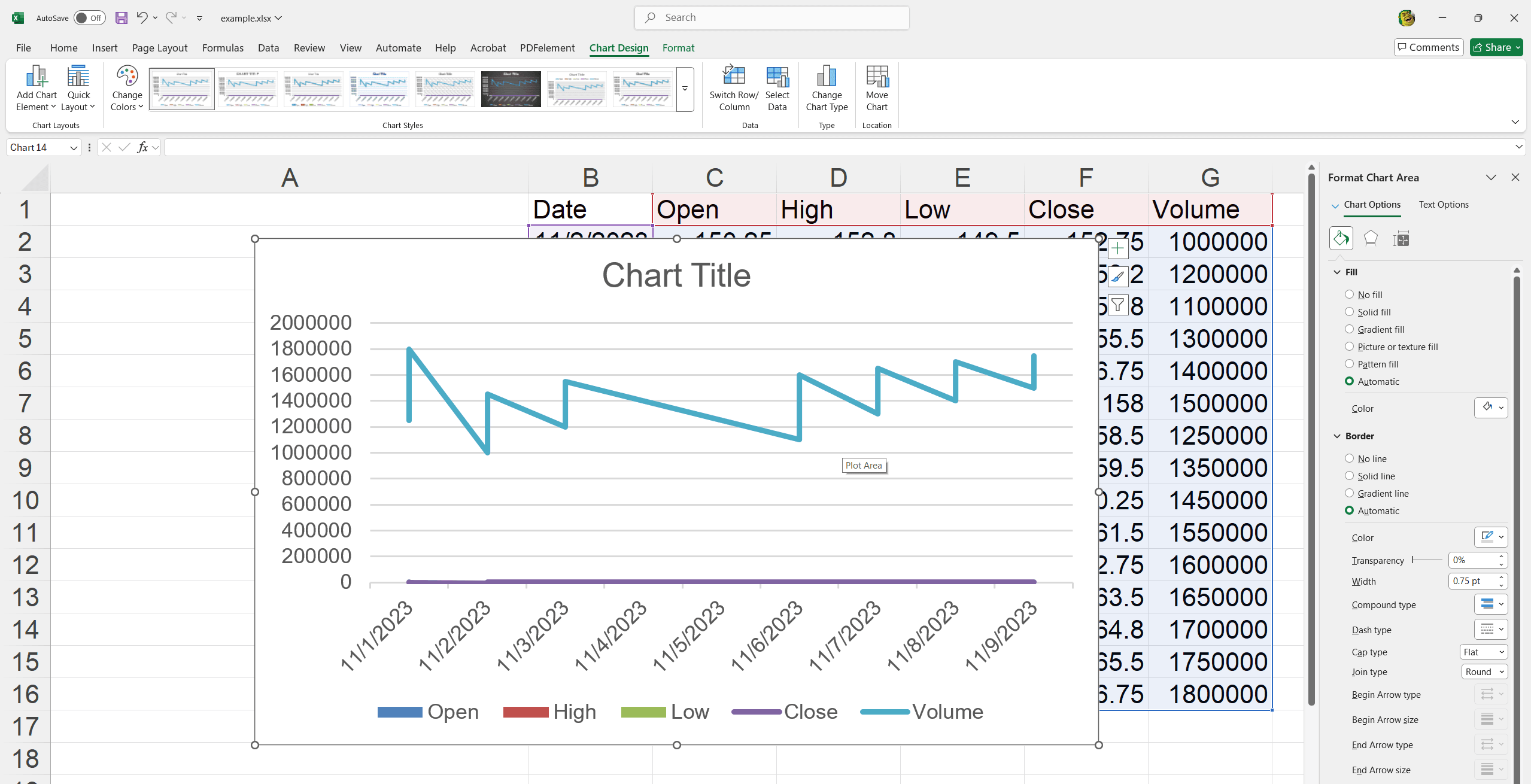
18. Combo Chart
A Combo Chart in Excel combines two chart types to visualize different data sets in a single graph, enhancing comparison and trend analysis.
- Compare actual vs. target sales figures.
- Analyze revenue and profit margins simultaneously.
- Track attendance and performance metrics together.
Now that you have created charts and learned about several types of charts. It's time to save the chart you created using different methods. Here, we show 2 ways you can decide based on your task requirement.
Save, Share, and Present Your Chart
Save charts as images or PDFs for easy sharing
1. Right-click on the chart's border and select Copy (avoid clicking inside the chart).
2. Open Paint and paste the chart by clicking the Paste icon or pressing Ctrl + V.
3. To save the chart as an image.
4. Click Save as.
5. Choose a format (.png, .jpg, .bmp, .gif).
6. Click other formats to save as PDF.
Embed charts in PowerPoint, Word or emails.
To export an Excel chart to applications like Word, PowerPoint, or Outlook, the most efficient method is to paste it directly from the clipboard.
1. Copy your chart as detailed in the previous step.
2. Click where you want the chart and press Ctrl + V in your Word document or PowerPoint slide.
3. Alternatively, you can right-click in the document to access various Paste Options.
For Further Reading
It lets you insert a functioning Excel chart into another file and maintain its link to the original spreadsheet. The chart will update automatically when the Excel data changes.
And there you have it! Our little tale of chart creating, customizing, and exporting has come to an end. You can effortlessly weave your Excel visuals into any Office application with these simple steps in your toolkit. Try keeping your presentations fresh and engaging. Now, go ahead and let your data tell its own story! The right chart can make your data speak volumes, aiding informed decisions and effective communication. Check out the insightful articles on PDF Agile's Knowledge Blog for more tips and resources.

